Classic Blue: Pantone’s Color of the Year “Instills Calm and Confidence”
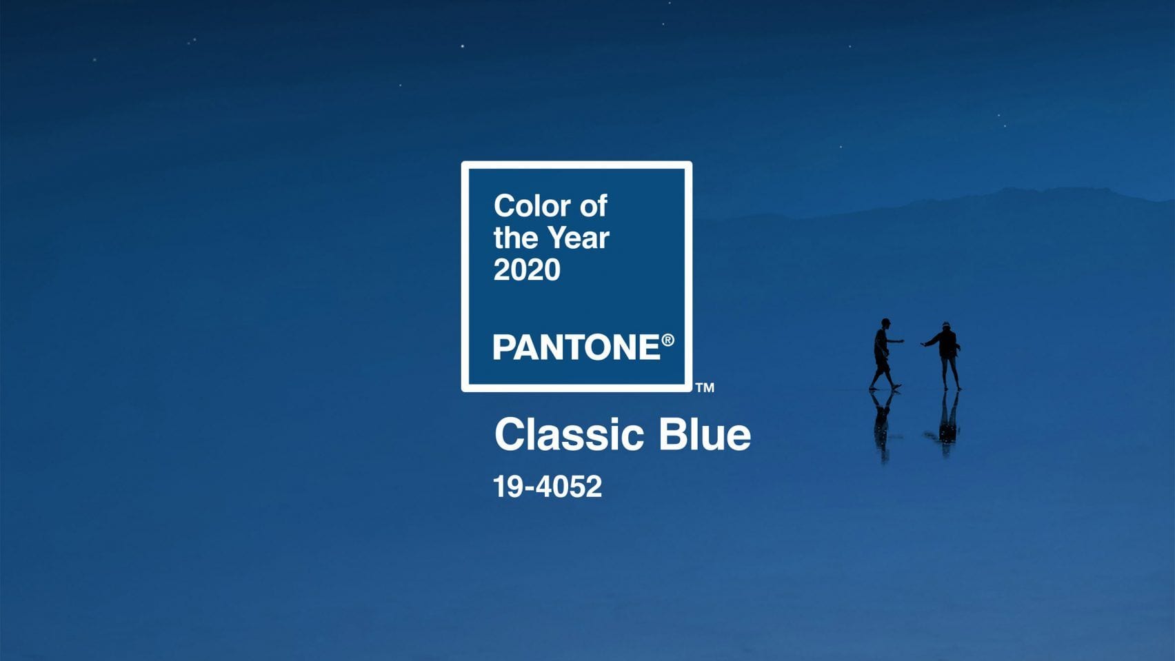
Evoking the color of the sky at dusk, Pantone’s 2020 Color of the Year was chosen for its simplicity, elegance, and “reassuring qualities,” according to the color experts. “Classic Blue” is not quite as bold as royal blue and lighter than navy, remaining firmly in the middle of the blue spectrum with no green or purple tones to be found. Pantone says the enduring hue “highlights our desire for a dependable and stable foundation on which to build as we cross the threshold into a new era.”

You can probably interpret that statement any number of different ways, but Pantone makes it clear that for them, Classic Blue is a calming refuge that can help bring “laser-like clarity” to our thoughts.
“We are living in a time that requires trust and faith,” says Leatrice Eisman, Executive Director of the Pantone Color Institute. “It is this kind of constancy and confidence that is expressed by PANTONE 19-4052 Classic Blue, a solid and dependable blue hue we can always rely on. Imbued with a deep resonance, Classic Blue provides an anchoring foundation. A boundless blue evocative of the vast and infinite evening sky, Classic Blue encourages us to look beyond the obvious to expand our thinking, challenging us to think more deeply, increase our perspective, and open the flow of communication.”

The company goes on to explain that, in this time of upheaval and uncertainty, we could all use a mood-enhancing color that’s non-aggressive and easy to relate to — a “universal favorite.” But not everyone is a fan, to say the least. Fast Company called it “awful” in an outdated sort of way, with the author noting that “I’m not offended by ‘Classic Blue,’ but I’m offended that Pantone has assigned it the vitally important role of ushering in a new decade, particularly one that follows a decade as tumultuous as the 2010s. ‘Classic Blue’ feels aggressively 1997.”
Dezeen has expressed similar concerns about Classic Blue feeling less than fresh, saying “Pantone has missed the mark once more.” Last year, Pantone elicited a bit of controversy by naming Living Coral as its 2019 Color of the Year, during a time when actual living coral is actually pretty hard to come by. Other trend forecasters chose shades of green as their color of the year for 2020, including WGSN and Behr paints. The former says its “neo mint” choice is an “oxygenating, fresh tone that aligns science and technology with nature.”

A vital green does seem like a more fittingly optimistic choice as we enter a new decade in a time of climate change anxiety and political strife. Whether Classic Blue feels relevant probably depends on your own emotional connections to colors and what they mean to you.
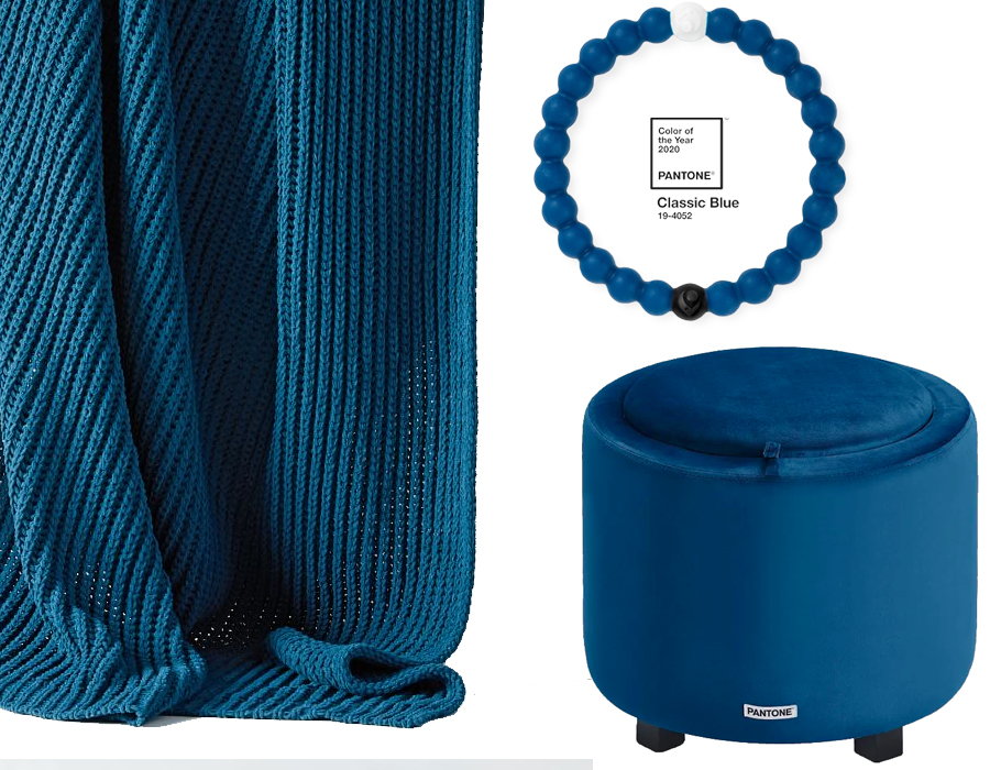
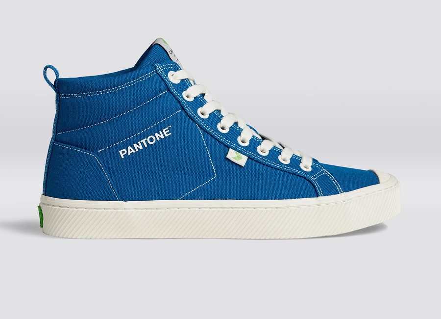
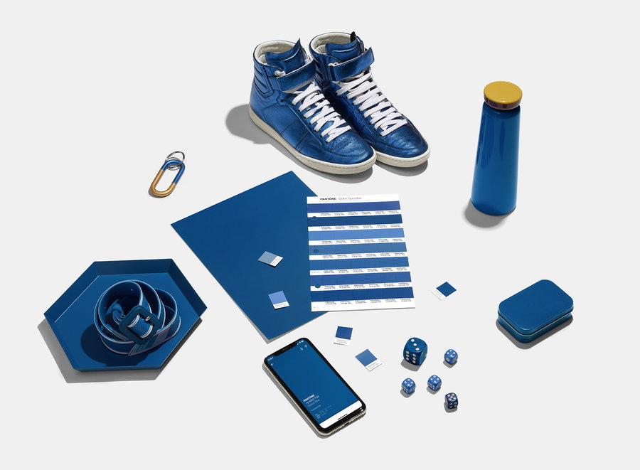
Whatever your feelings may be, whether it’s tapping the zeitgeist or influencing it, Pantone’s choice has an undeniable impact on color trends, and lots of products have already been made available in the shade. They include a Pantone Color Collection storage stool, available at Target, Cariuma’s Pantone Classic Blue Canvas OCA High shoe, a beaded bracelet by Lokai, and other official collaborations. Naturally, it’s also showing up in new collections from big retailers, like West Elm’s spring textiles.

If you’re wondering how to use Classic Blue to its best advantage, you’re in luck: Pantone has already offered up some sample color palettes in themes like “ponder,” “snorkel,” “desert twilight,” “exotic tastes,” and “untraditional.” Of course, you can always play with it yourself and see what you come up with.


