Chromesthesia: HomeAdvisor Turns Different Music Genres into Colorful Interior Designs
Ever heard of synesthesia before? It’s a neurological condition in which stimulation associated with one of your senses ends up stimulating several different ones. It manifests in a few different forms, including chromesthesia, in which sound involuntarily evokes an experience of color. People with this kind of synesthesia can listen to music and see a symphony of colors their brain associate with the sounds, allowing them to essentially “translate” audio input into visual output.
Artists of the past who are thought to have “painted” sounds include Vincent Van Gogh and Wassily Kandinsky, and many more share their works with the public today. But have you ever seen this unusual talent used to produce moody interior designs?
HomeAdvisor asked two synesthetes, Rachel and Michael, to digitally redecorate a single room design across a range of musical genres by listening to ten songs from the top of each of Billboard’s genre charts.
“I actually hear colors and motions, whereas some people just hear colors,” says Michael. “For example, if I hear drums in a song, I can see the colors moving based on the sound. I predict that having chromesthesia probably boosts my creativity, but I don’t know what it’s like to hear music without it. Maybe if I didn’t have it, I would still love music the same amount!”
While the music was played, Rachel and Michael listed the colors they experienced, and HomeAdvisor added the colors agreed upon by both to the genre’s “palette.” The results might not be exactly what you’d expect.
Rock Room

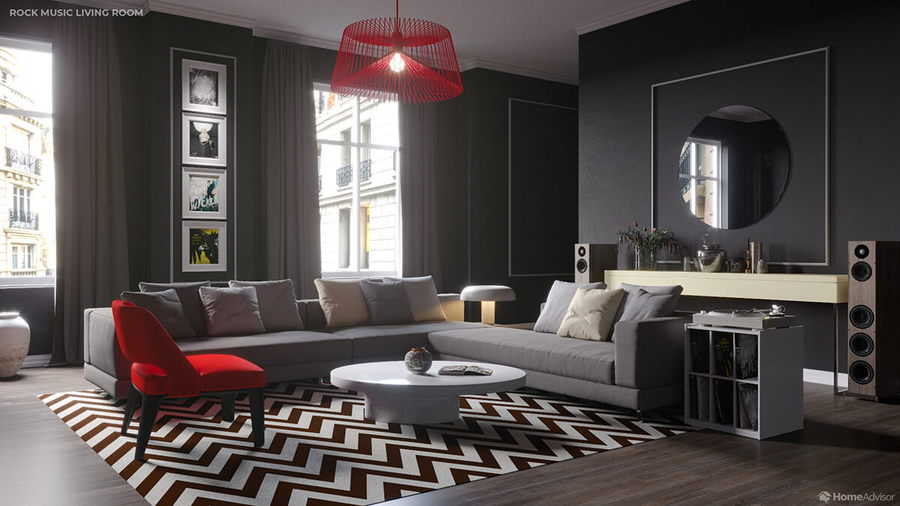
A playlist of rock songs including Ozzy Osbourne’s “Under the Graveyard” produced this black, white, and gray room with pops of red, champagne, and cream.

“Different instruments carry their own color,” says Rachel, “blending with the hue of the notes being played on them and with the way each artist plays that note. But these colors also have a sort of texture, like metallic, wet, velvets, speckled, or smatterings of paint on a screen. The smoother the vocals, the more petal-like the sound.”
Country Room


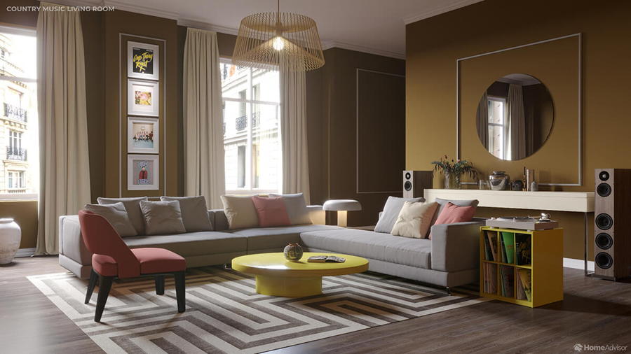
To Rachel, “country music is a brown genre,” with more limited instruments, melodies, and influences than other genres. The resulting room is fittingly the most conservative of the bunch, even with contemporary songs like Dan + Shay’s “10,000 Hours” featuring Justin Bieber.
Pop Room


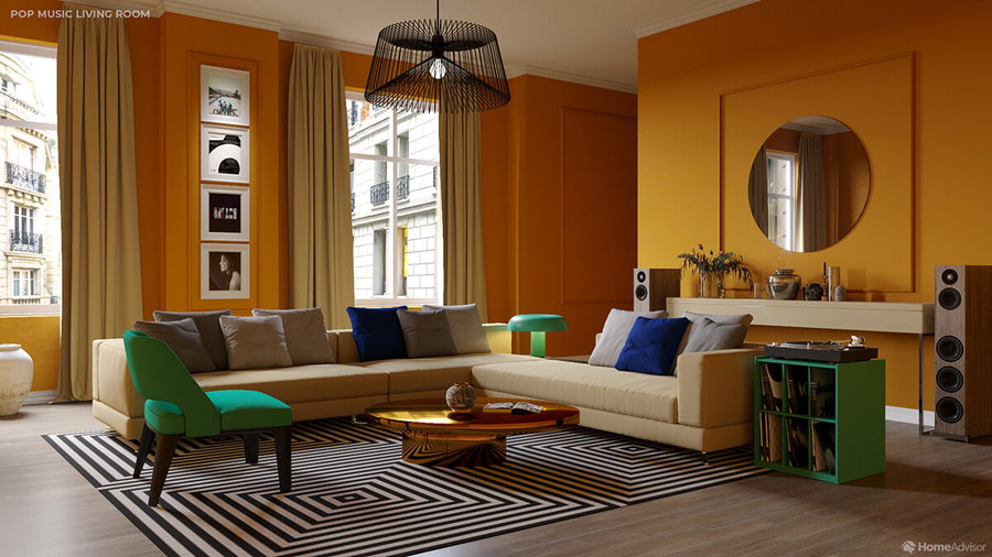
The pop playlist, featuring “Circles” by Post Malone, evoked a predictably brighter color scheme, including navy, jade green, metallic gold, and ecru. While these are bolder choices, they still blend together relatively easily, with enough harmonies to feel easy to live with. And given the broad popularity of pop music, it actually makes a lot of sense when you think about it.
Rap Room

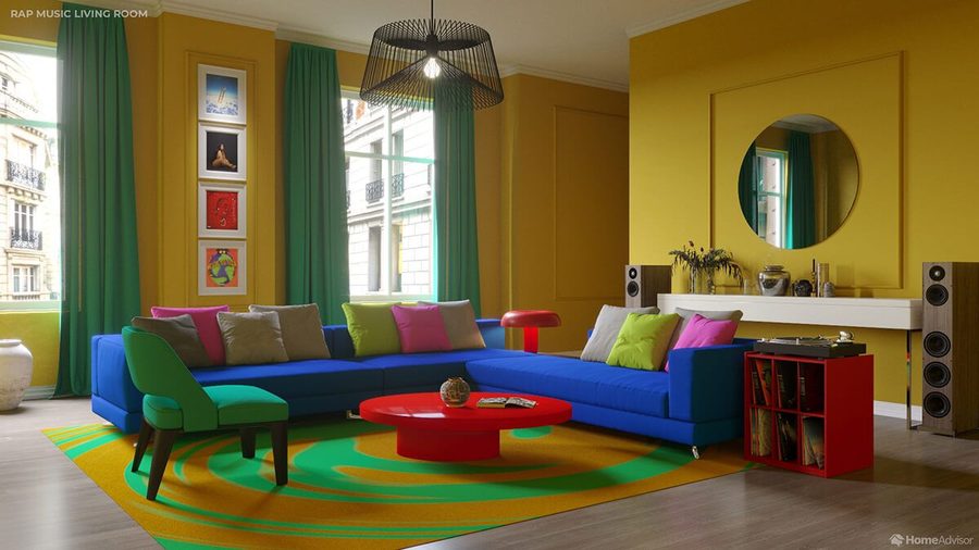
Here’s where things get really surprising. This vivid, cheerful, almost child-like color palette might not be what you’d normally associate with rap, but it could reflect the diverse array of influences and samples that go into a typical rap album. It gets a little clearer when you catch the influence of Lizzo’s “Truth Hurts.”

Check out the rest — including a J-pop room, an R&B room, and a heavy metal room — over at HomeAdvisor, where you can also listen to the playlists that influenced each result.