2021’s Color Palette Reflects Our Need for Comfort and Serenity
Many of the nation’s largest paint companies have already unveiled their color picks of the year for 2021, and based on their selections, it’s clear that the cold and detached shades of the past few years are on their way out. After a year of social distancing, people are ready for hues that invite and comfort.
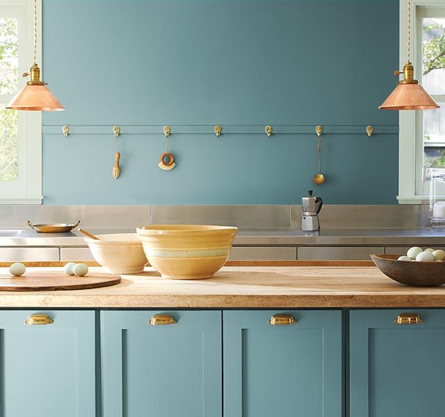
According to Fixr’s Paint and Color Trends survey of 68 of the country’s top interior designers and influencers, 81 percent believe that quarantining and staying at home has strongly affected homeowners’ color choices, and that those choices are skewing warmer in general. More than half of the design experts said that earthy and warm neutral tones are replacing gray as the most popular customer requests. And 54 percent of the group also see clients requesting pops of bold tints to go along with those neutrals, showing our collective wish for both calming and fresh spaces.
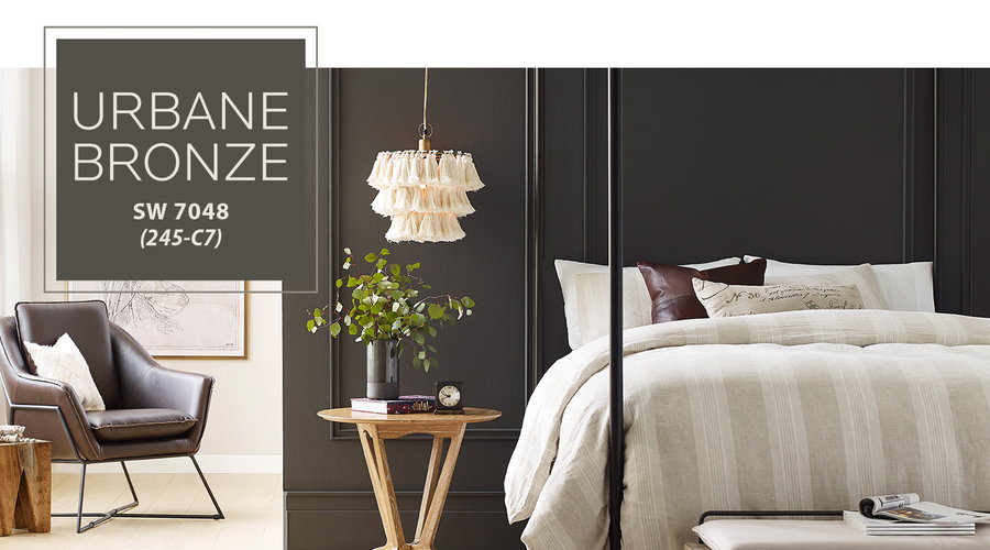
For example, Sherwin Williams’ 2021 color of the year is Urbane Bronze, a “grounding shade” of gray-brown. “The home is now the ultimate retreat from the world, and color is an easy and effective way to create a personal haven,″ says Sue Wadden, the company’s Director of Color Marketing, adding that ″Urbane Bronze encourages you to create a sanctuary space for mindful reflection and renewal.”
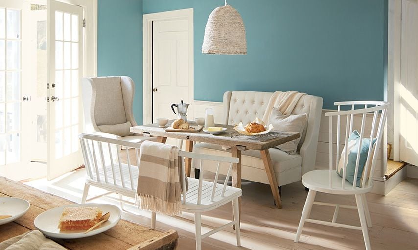
Benjamin Moore chose a hue designed to soothe as well: Aegean Teal. It’s “an intriguing blue-green that creates natural harmony and invites us to take a moment to reflect and reset,” according to Hannah Yeo, the company’s Marketing and Development Manager. Benjamin Moore also chose 11 other colors to make up their 2021 color trends palettes, mostly comprising a mix of creamy whites and earthy browns, along with a sunset array of oranges and yellows.
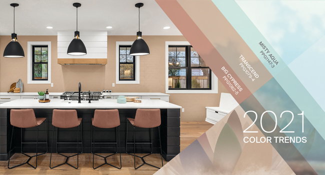
PPG chose an entire color palette rather than a single chroma for 2021, ultimately deciding on its oatmeal-shaded “Transcend,” persimmon-tinged “Big Cypress,” and fresh-faced “Misty Aqua.” The PPG design experts chose these complementary hues specifically “to bring warm lightness and a sense of calm to a space.”
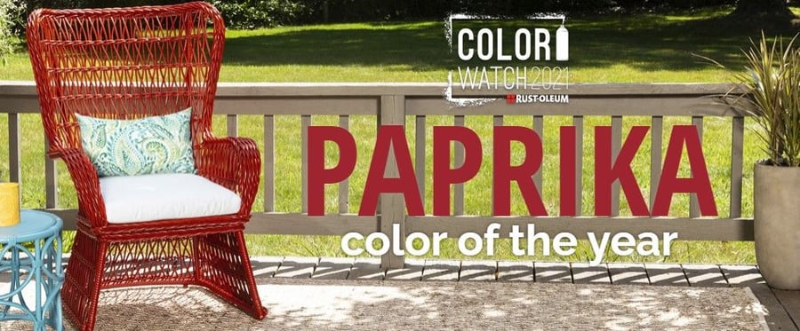
Spray-paint corporation Rustoleum selected a spicy tint of red called “Satin Paprika” as its shade of the year and used it as the base of three new warm palette suggestions. “We’ve been listening to DIYers and home decor enthusiasts who want color combinations that bring out feelings of well-being,” says Grace Khoury, Brand Manager at Rust-Oleum. “We’re living in uncertain times and we all need a little peace. These collections are designed to evoke a sense of settled contentment.”
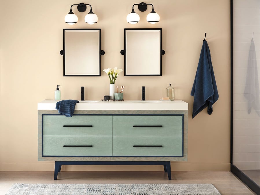
Minwax, a wood-stain brand, also got in on the action by naming its first-ever color of the year: “Vintage Blue”. “Vintage Blue connects us to the healing power of nature and a comforting nostalgic mood,” says Sue Kim, the company’s Color Marketing Manager. “Like a moment of fresh air, Vintage Blue gets us started in the day with a renewed mindset.”
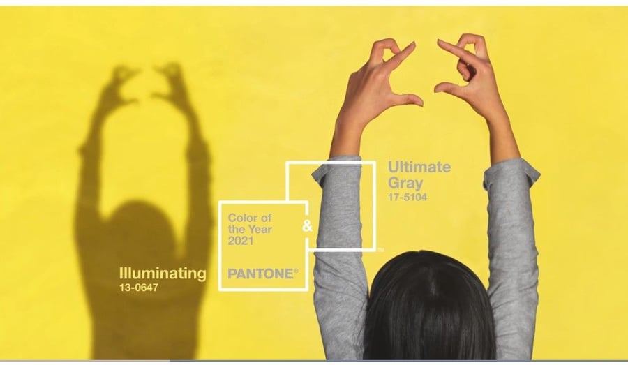
And of course, Pantone chose two colors of the year for 2021: Ultimate Gray and Illuminating. “The selection of two independent colors highlight how different elements come together to express a message of strength and hopefulness that is both enduring and uplifting, conveying the idea that it’s not about one color or one person, it’s about more than one,” says Leatrice Eiseman, Pantone Color Institute Executive Director. “The union of an enduring Ultimate Gray with the vibrant yellow Illuminating expresses a message of positivity supported by fortitude.”
The combination of bright yellow and gray creates a pulsating energy, a vision for brighter days ahead. And okay, maybe gray isn’t dead just yet.

The predictions are decisive: 2021 colors will push away the isolation and dreariness brought on by the COVID-19 pandemic with warm neutrals and refreshing, invigorating hues.


