House on House: An Experimental Way to Expand a Suburban Residence
In many American suburbs, nearly-identical homes line neatly organized streets, all with nearly-identical landscaping and fencing in colors approved by the local homeowner’s association. There isn’t a lot of room for creativity and experimentation. So when homeowners decide it’s time to build an addition, they usually have little choice but to go with the prevailing style. Some may argue that such limitations keep the neighborhood looking uniform and tidy. Others find it all terribly boring. With “House on House,” New York-based studio Architensions took a more daring approach.
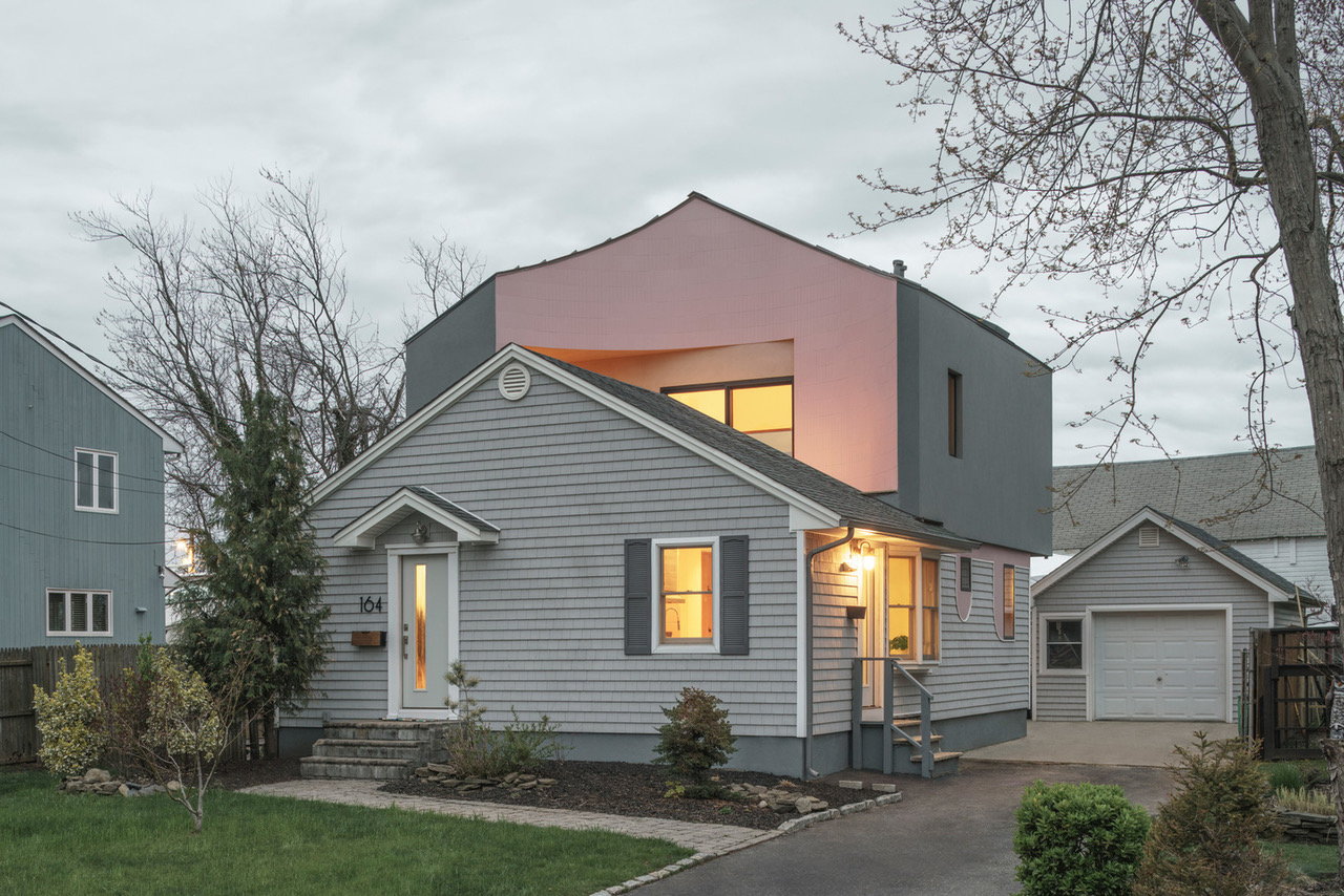
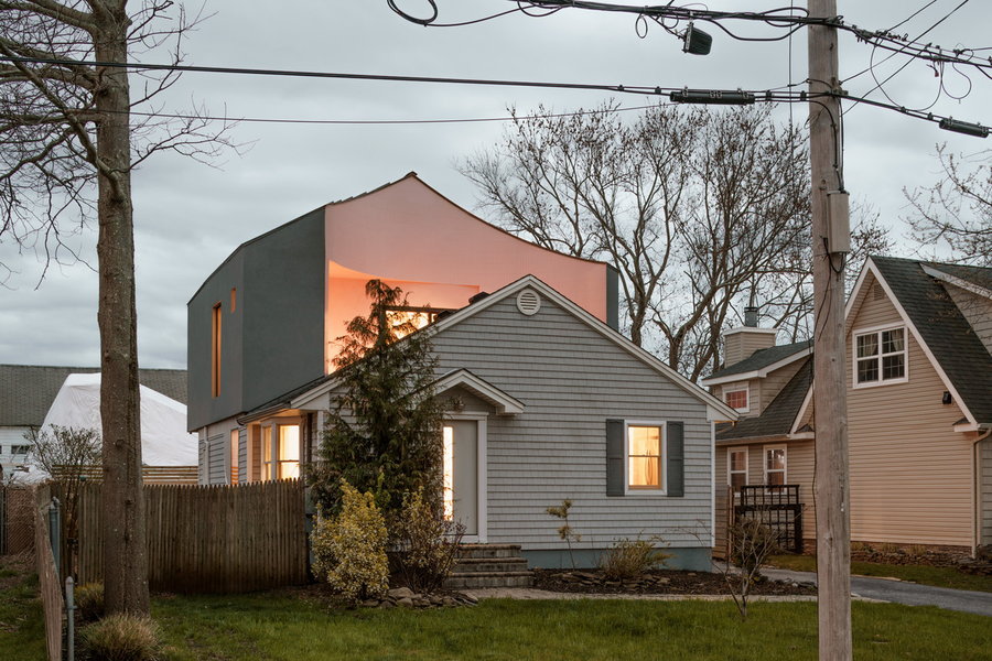
There’s nothing conventional about this second-floor addition to a compact house in the Babylon area of Long Island, New York. Not only does it flout the very modest conventional styling of the existing home, it looks like an entirely different home was just plopped right on top of it. That effect is intentional. The architects didn’t want the home to simply blend in, but rather offer a contrast of past and present, both visually and programmatically. While the original home is clad in light gray vinyl siding, the addition features thick stucco exterior walls. The two volumes are merged together by a splash of pale pink tiling flowing across the facade.
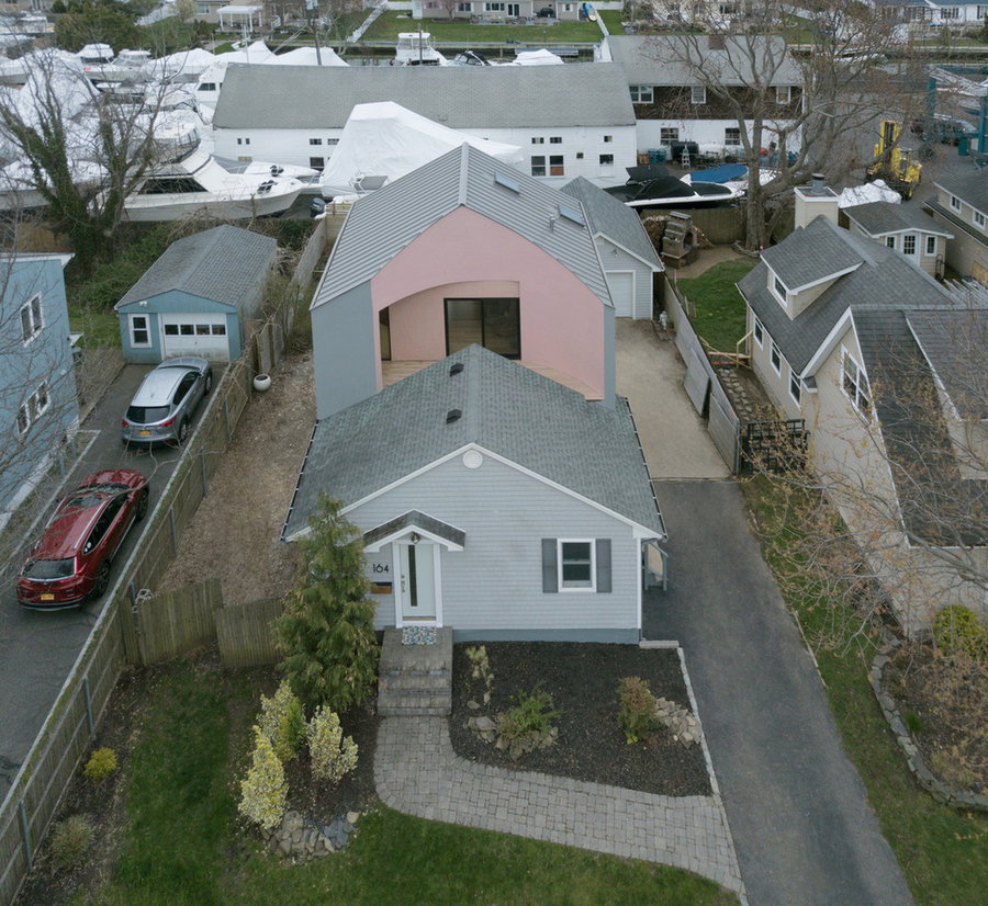
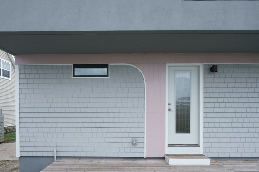
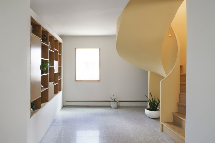
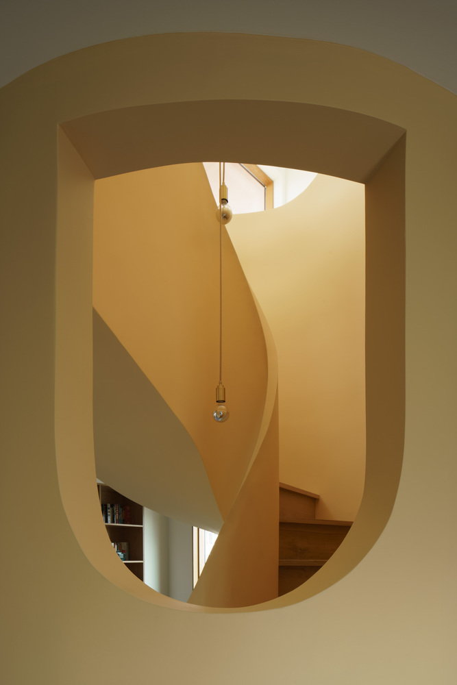
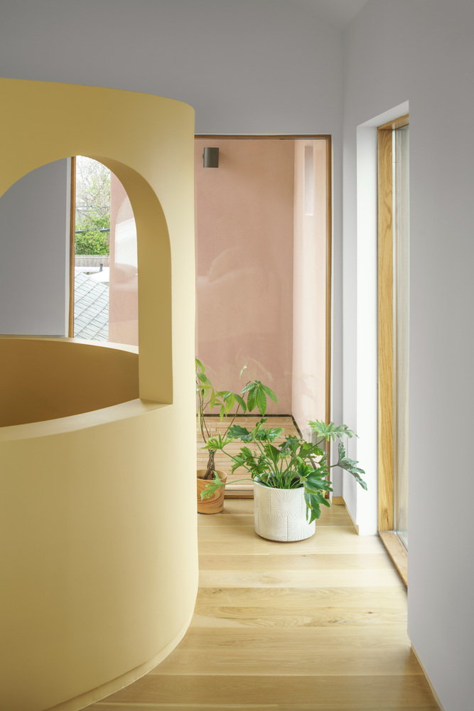
The client didn’t care much about resale value, opening up the potential for the architects to experiment. Instead, he asked them to update the original layout of the existing home and draw down some of the new features to create visual transitions, like a bold sculptural yellow staircase. The circular form of the staircase is echoed by the curves of the addition, including its street-facing facade.
“This prompt set the stage for a design process rooted in extensive research into the cultural history and architectural taxonomy of the surrounding suburban neighborhoods,” the architects explain. “In particular, co-principals Orsini and Roseboro were interested in the home’s proximity to Levittown, NY, a suburban development archetypal of the relationship between race, inequality, and housing in America, in which segregation was embedded in its formation through exclusionary contracts and redlining.”
The firm adds: “In Levittown, African Americans and indigenous communities could not access sales contracts by specific prescription of the Levitt & Sons Company; this was true of similar developments across suburban America and their surrounding neighborhoods. Further inherent in the typology were architectural features and layouts that fostered the isolation and introversion of the nuclear family, rather than the community.”
The original home’s design was identified as mimicking that of the standardized homes made popular by Levittown, which emphasized conformity and a lack of flexibility. The architects identified architectural elements like windows, porches, and roofs that are often found on these suburban homes and “hacked” them to simultaneously reference the neighborhood’s architectural history and defy it.
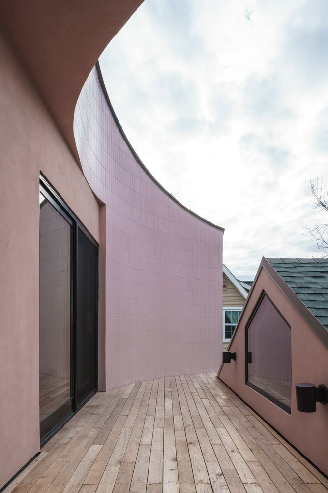
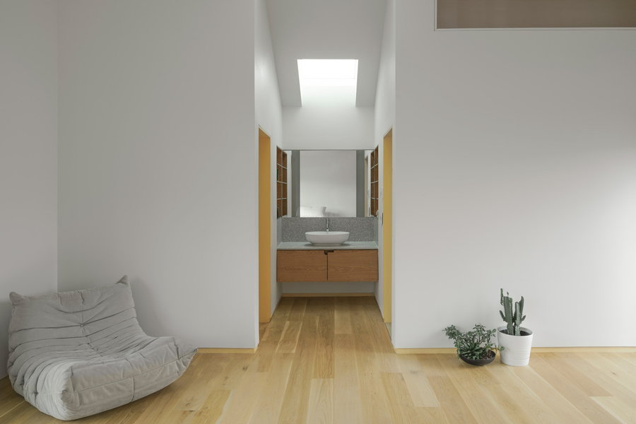
While most suburban homes are concerned with privacy, the client wanted to challenge those norms, creating big open cut-outs and and terraces that don’t attempt to hide from the prying eyes of strangers. He also requested that the architects eliminate the typical suburban separation of bedroom and bathroom in the upstairs suite.
“House on House” may not be for everyone, but that’s the point. The project questions whether seeing more expressions of personal tastes and preferences in the architecture around us could inspire more people to appreciate the little differences that make us who we are.


