Beautiful 3-Box Rubber-Band Set Doubles as Desktop Decor

This designer’s mission was deceptively simple: take one of the most boring objects possible and rebrand it inside and out in a radical new way. If one can take uninteresting square-boxed rubber bands and do something like this, the possibilities are endless.
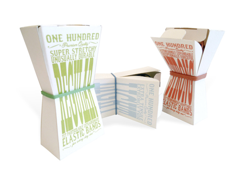
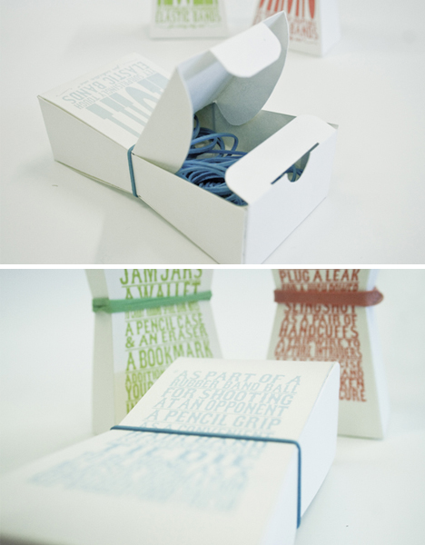
The box itself looks to be squeezed by the bands, a few of which are placed on the outside (and conveniently stay put thanks to the slim center), showing you what you are about to buy. Rick Bixter goes another step and lists off some serious and some silly uses on the box backs as well.
Would you like Light, Regular, Serious, or perhaps all three? Elegant typography and a bold-but-complimentary color set make it tempting to stand the whole series on top of your office desk rather than burying one or more of them in a drawer – likely a good idea given their odd shapes as well. From product to packaging, a lovely redesign all around.


