How to Simply Feel Better: Pared-Down Medicine Packaging

The over-design of consumer products is a problem, whether the majority of us realize it or not. The people at Help Remedies saw a particular need in the area of over-the-counter pharmaceuticals; in their estimation, we take way too many drugs and the packaging in which those drugs come is far too confusing.
Help Remedies embraces a philosophy of “Take Less.” They believe that when you are not feeling your best, you should be able to simply reach for a product that says what it does and does what it says – without a bunch of added trouble or unnecessary ingredients. Their line of simplified remedies has been available in drug stores and gift shops around the US since late 2011.
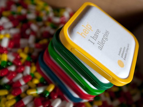
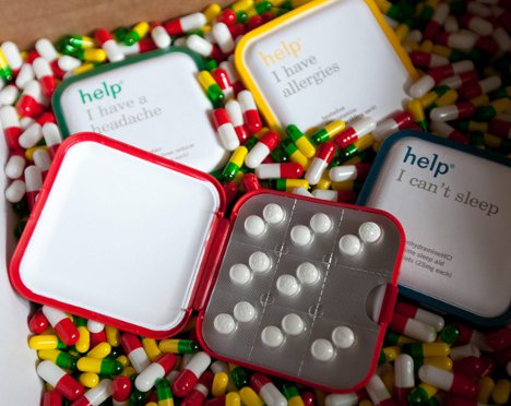
Each pack of medicine features a simple, easy to understand name like “Help – I Can’t Sleep” rather than a complex mediciney-sounding title. The pills themselves contain one ingredient only, an effort by the company to reduce the number of “drug cocktails” we ingest. And for good measure, the pills themselves are just as simple as the packaging: no dyes, no fancy sugar coatings.
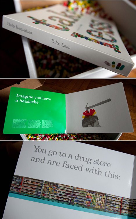
The Take Less board book is a complementary bit of marketing that explains the company’s philosophy. Sent out to members of the press, the book uses easy-to-understand terms and simple graphics to tell the story of Help Remedies and why the company chooses to do business in such a straightforward way.
Cleverly packaged with empty gel capsules and a sampling of Help packs, the book emphasizes the importance of filling yourself full of fewer medications, dyes and decisions. The fantastically minimalist product line – and its associated bare-bones marketing campaign – is a welcome change from the over-packaged, over-designed, over-marketed products we see on store shelves every day.


