Optical Illusion: Anamorphic Alphabet Made of Everyday Objects

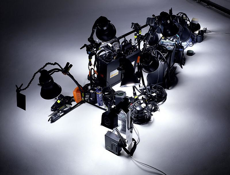
The ‘font’ itself is simple, and the process strangely circular – epic amounts of work are put into placing all of the pieces of this anamorphic alphabet in three-dimensional space, all to set the stage for single photograph of what looks like a two-dimensional letter.

Dan Tobin Smith has done everything from advertising and interiors to still lifes, but these bold and elemental alphabet shots stand out from his expressive and varied portfolio.

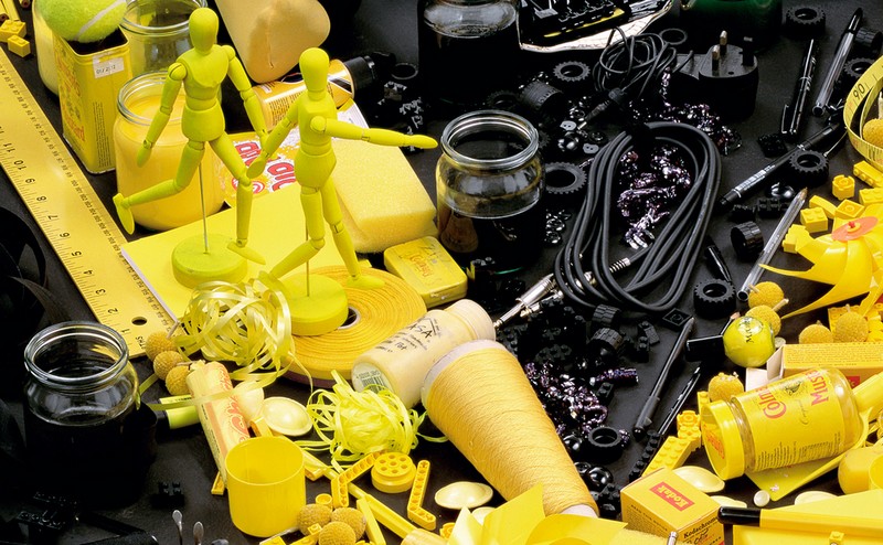
The material palette is as broad as it gets – from the broken boards of an old floor to bright flowers and back-lit medical beakers, either defining the edges or interior of each typographical element in this ongoing series.

This is one of those cases where setting parameters and creating consistency through recognizable symbols is (ironically) liberating, setting up a series of colorful (as well as black-and-white) contrasts from one moment to the next.


“Starting with a commission from Creative Review to create the cover for their Annual and shot over the last 8 years. The project now incorporates 19 letters, comprising of 93 images, 4 films, a host of supporting material including 10×8 inch polaroids and permanent three dimensional pieces. Each letter is different and incorporates a different visual idea. Some primarily conceived for film, some sculpture but always made as a photograph.”

“The project makes use of anamorphosis, otherwise known as distorted projection, helping to build the letters with a high degree of accuracy. This was used in commercial photography, in subtler forms going back over the past 50 years as a way of refining composition in still life photography. People have been using linear perspective in art dating back to the early 15th century and you can see an early example of the use of actual anamorphosis in Hans Holbein’s The Ambassadors in 1533.”
“In photography, the earliest image using anamorphosis dates back to 1913, fairly early in photography’s history but it is also the most impressive in its scale of any photograph using anamorphosis. The Human U.S. Shield by Arthur S. Mole and John D. Thomas consists of 30,000 officers and men of Camp Custer in Michigan making up an enormous U.S. shield on the grounds of the camp.”