Why It Matters That Apple Park Was Not Designed For You


When Apple began moving its Cupertino, California-based headquarters in April of 2017 (the workplace of some 12,000 employees), it was supposed to be the beginning of a new era. But ever since the first renderings of the new HQ were made public back in 2011, critics have lambasted its design. When more renderings were released a couple of years later, one article even called it a “vision of the future from 1939.” If this is true, then Apple Park was definitely not designed for you.
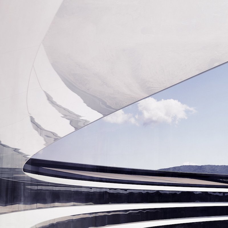
Now that it’s completed, the tech company’s new four-story, ringed-formed headquarters has received even more criticism (personally, I’m not much of a fan either). Apple knows better than most companies that any time you finish designing a product, you should always get feedback from others, as they’ll be able to look at it with fresh eyes and ask pertinent questions about its appearance. Functionality matters the most, but form can make all the difference when it comes to overall design. Nobody wants to design something that looks silly, no matter how functional it may be. That’s why we have to ask pertinent questions to avoid producing a folly.
“Does it look stupid? Does it look like an animal? Does it look phallic? Does it look like some familiar object?” If it’s a building, some more pertinent questions might be “is it a duck or a decorated shed? Does it look like a copy of another building? Does it look like a spaceship?” Unfortunately, Apple Park does.
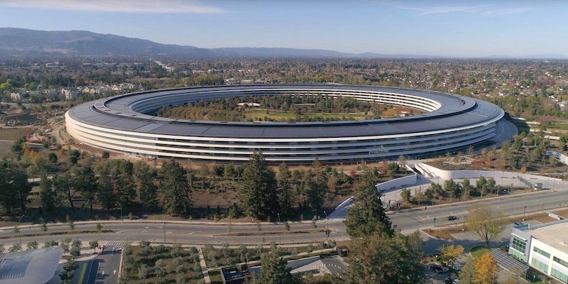
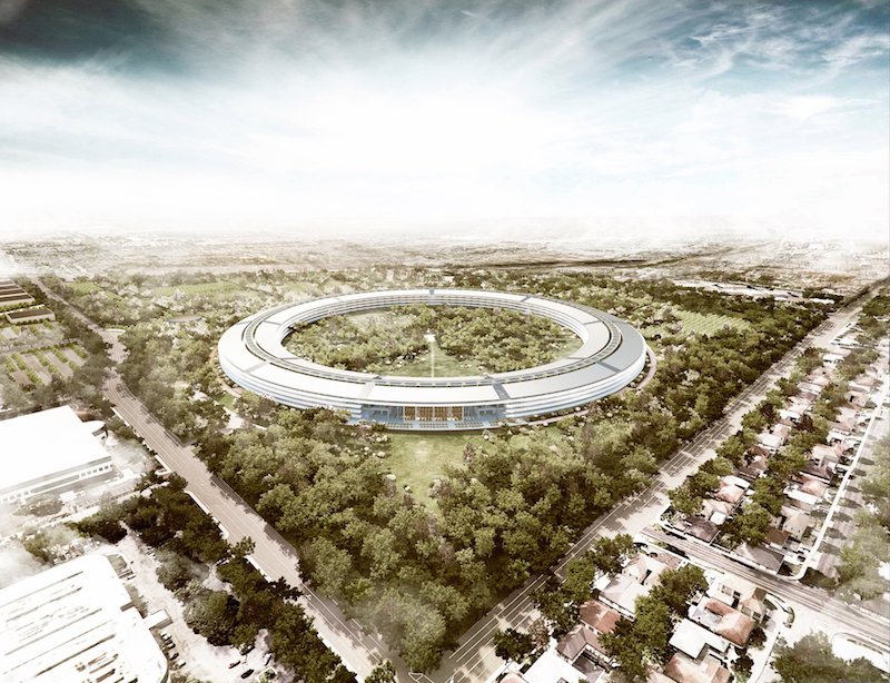
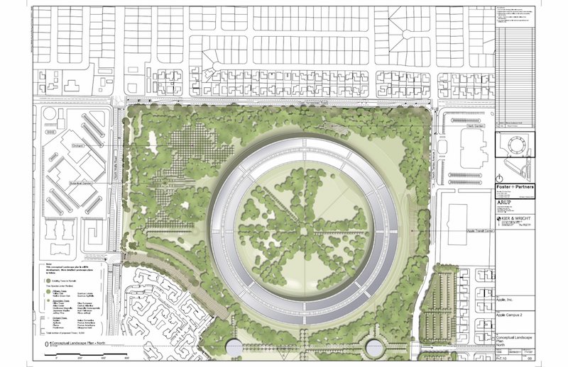
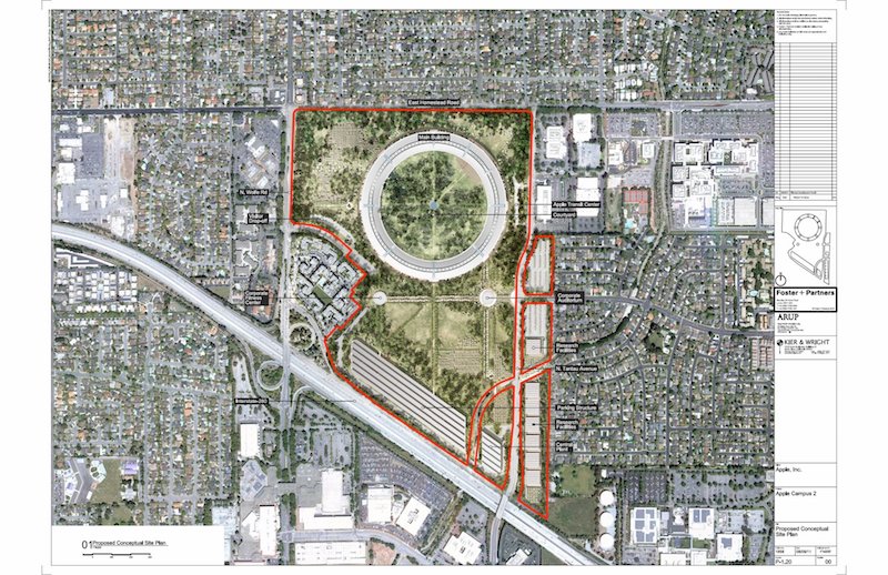
More specifically, Apple Park looks like one of those fictional headquarters built for a diabolical multinational corporation that you’d expect to see in a Marvel movie. However, this is not a make-believe headquarters, but a real $5 billion, 2.5 million-square foot one built on 175 acres and designed by Foster + Partners. It took eight years to complete, or approximately 12 iPhone cycles, if you prefer to keep track of time that way. The last batch of employees moved in toward the end of 2017.
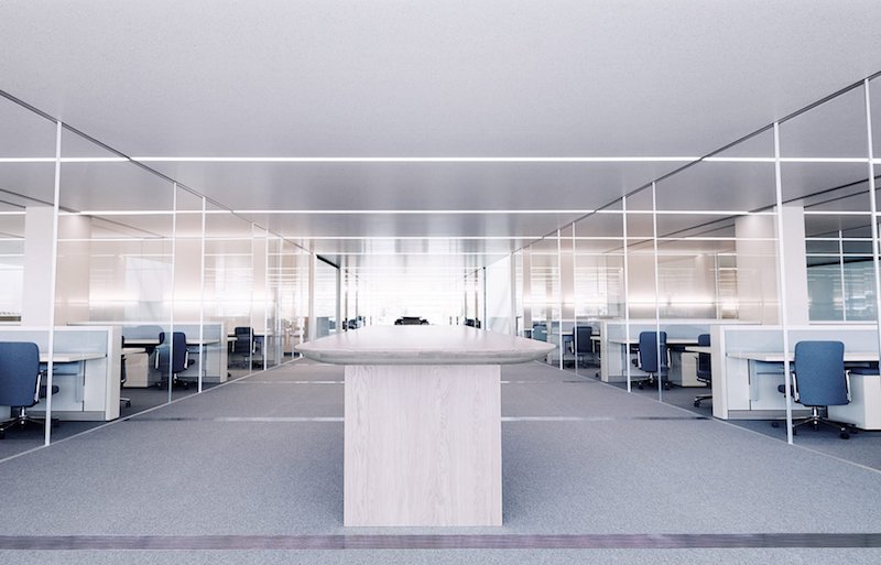
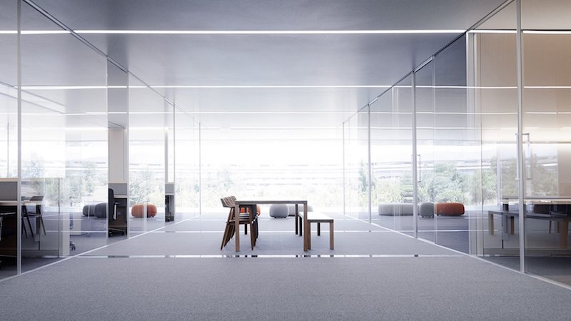
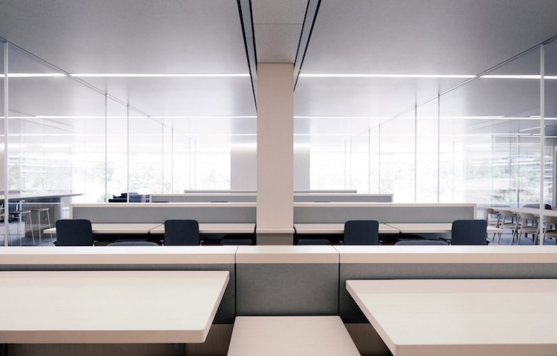
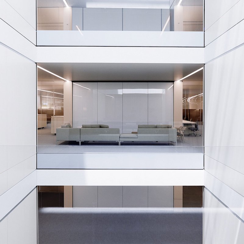
Though the exterior of the building has garnered much derision, the interiors are admittedly not getting the praise they deserve. They’ve been designed exactly as you’d expect a office that embodies the ethos of Apple to look like. There are sleek reveals, crisp lines, ergonomically-practical working pods, an intelligent use of lighting, and panoptic views of the building’s central green space. These workspaces are all open-plan, featuring furniture pieces designed by Naoto Fukasawa, and all the wires and cables in them have been deftly hidden. There’s also an atrium that rises the entire height of the building for a cafeteria. The headquarters is so gigantic, there are even bikes and electric golf carts on-site to help employees ambulate it.
In an article from June 2017, Apple’s chief designer, Jonathan Ive, pushed back against the criticisms of Apple Park with a truth that often gets lost in architectural discourses. “We didn’t make Apple Park for other people,” said Ive. “So a lot of the criticisms are utterly bizarre, because it wasn’t made for you! [laughs] And I know how we work and you don’t!”
Apple Park’s design allows the company’s entire design team to work as one unit. For Ive, that means “that an industrial designer will be sitting next to a font designer, who will be sitting next to a sound designer, who will be sitting next to a motion graphics designer and a haptics expert, and somebody who is used to working on three-dimensional figures that are animated next to a user interface expert, with digital model makers and physical real-world model makers.”
While Ive is right, and Apple Park was not designed for you or me but for the Apple employees, he’s missing the point when it comes to understanding why the criticisms matter.
Beyond the glaring failings of its architecture, where Apple Park truly fails is in its lack of integration into the community around it. It could have been a lifestyle campus, with the headquarters making up just a part of a mixed-use zone that also housed residential buildings (for employees and non-employees alike) and retail spaces. Instead of one building on 175 acres, it could have been a collection of buildings, streets, pathways, and parks.
This is why the criticisms of Apple Park harkening back to an era where big corporations used architecture to project a certain dominance or stature are applicable. Sure, a headquarters is not like an iPhone designed for individual use, but any building that huge in the middle of a suburban landscape matters to us all, whether we like it or not.
