New Magazine Celebrates Mid-Century Logo Design


Mid-century furniture has been an ongoing design trend for some time now, with big homeware brands like IKEA constantly revamping and re-releasing mid-century collections for the public. Now, it seems as if mid-century graphic design is also making a comeback, mainly by way of social media and a new quarterly magazine that celebrates the understated graphics of the mid-century logo.
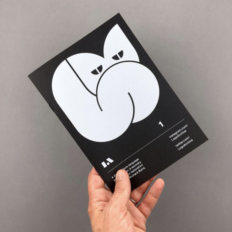
The magazine, entitled LogoArchive, rounds up some of the most iconic (as well as a few lesser-known gems) mid-century brand identities and logos and puts them together in a handy zine that any lover of good design will be able to flick through with ease. LogoArchive originally started off as an Instagram account, which itself now boasts an impressive 126,000 followers. The magazine bills itself as “A study of form language in logo design. A recovery, research, and restoration project.” Both the magazine and the Instagram account are run by Richard Baird, a London-based designer. He says of the project: “I have been scanning and archiving logos for a long time, and I have a network of designers with whom I collaborate with, who have access to an invaluable volume of historical artifacts, in particular Christophe De Pelsemaker of LogoBooks and Blair Thomson of CanadaModern.”


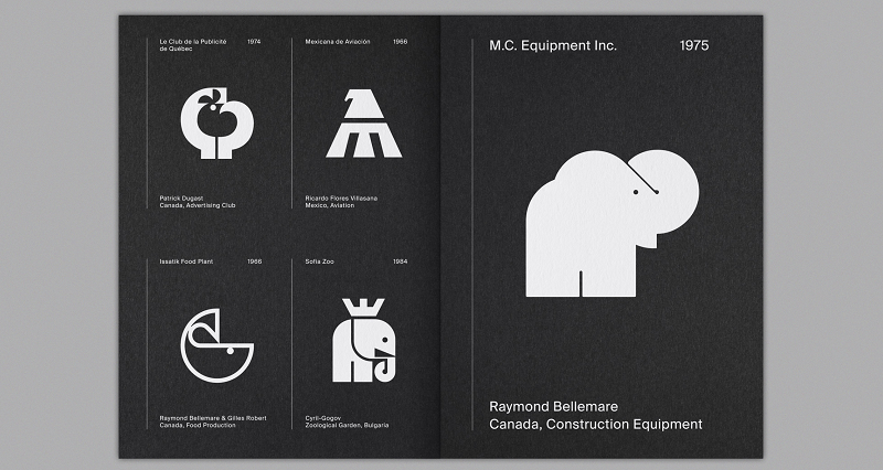
The success of the Instagram page lies in its clear and crisp delivery, which sees the logos take center stage. Each individual logo is executed in white on a black background, with the information being placed entirely in the caption so that the image is not interrupted. This is the same strategy that’s employed for the magazine, which sees the white logos set against dark backgrounds, with four laid out in a minimal fashion on each page, the year and company listed in white in the top corners, and the designers listed at the bottom.
Speaking on the process of choosing which logos to include in the zine and on the Instagram account, Baird explains: “All the logos featured in the zine speak to me personally, be that in the conviviality of a metaphor, the retention of a distinction and memorability, or a clever take on a family symbol.”

Some of the logos chosen by Baird distill the essence of good graphic design with their clarity of communication. One of the most interesting and well executed logos is that of the Place Fleur-de-Lys Centre Commercial, designed by Claude Plante in 1972. To create the logo, Plante had to take the iconic image of the fleur-de-lys and rotate it 45 degrees to conjure up the shape of a bird.
Baird speaks of his fascination with this moment in graphic design, saying: “The formalization of corporate identity design was in its infancy during the mid-century. There were a lot of opportunities to keep logos simple and communicatively immediate without the potential of infringing on the trademarks of others.”
The first edition of the print version of LogoArchive was published in July 2018, and it sold out very quickly. The second edition of the zine is being released at the end of August and is available to reserve here.