Minimalist Concrete Cosmetics Store Feels Like a Secret Laboratory


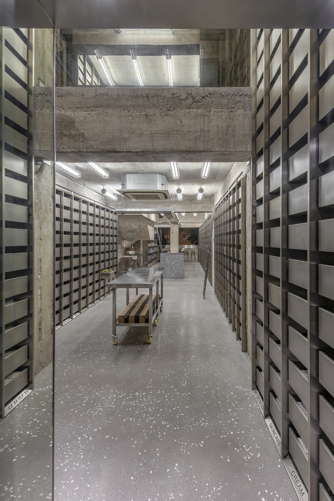
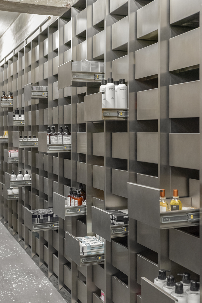
In centuries past, people purchased everything from cosmetics to medicine in old-fashioned apothecary shops, which were typically lined with floor-to-ceiling wooden shelves full of drawers and glass bottles. Even with thousands upon thousands of items in stock, everything was meticulously organized, and there was rarely any shortage of things to look at.

While there are still brands like Aesop that put a lot of effort into the presentation of their products and shops, most contemporary drug stores and retailers specializing in personal care products have lost that old apothecary charm, giving into the conveniences of fluorescent lighting, cheap metal shelving, and plastic containers instead. But who’s to say that a space can’t recall those classic aesthetics while also feeling decidedly modern?
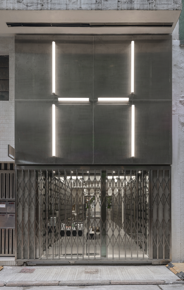
In the heart of Hong Kong, cosmetics pharmacy HARMAY takes the feel of an apothecary in a whole new direction. The company initially hired AIM Architecture to complete its flagship store in Shanghai in 2017, and this new brick and mortar location expands upon the first one’s streamlined metallic look.


HARMAY is primarily an e-commerce business, and it wanted its retail locations to feel like spaces that exist somewhere between the real world and cyberspace.
“Picture this: a bustling, winding, narrow Hong Kong street, packed with shops, restaurants, and food stalls,” says AIM Architecture. “Shutter gates open and close each storefront; inside, the shelves teem with packages and products. You almost don’t notice it. But still, a second glance — a perforated steel facade, LED lighting, an organized, almost austere unexpected interior, inviting you in from the outside… culturally, we are at an intersection. Consumers want convenience but crave experience. Online shopping will never lose its allure, but there’s a real challenge for brands to experiment with the dynamics of modern consumption.”
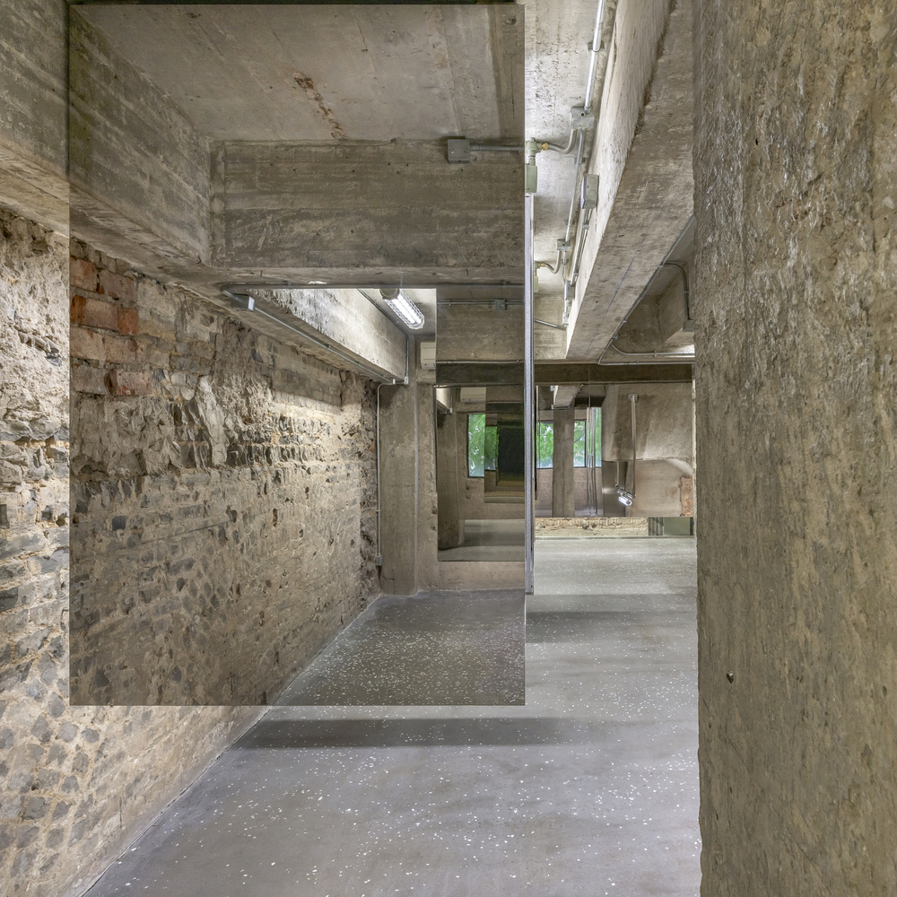
AIM took inspiration from old-school chemists for HARMAY’s Hong Kong apothecary, translating it into a mixture of old and new surfaces, with ancient bricks meeting concrete and mirrored steel all throughout. The point isn’t to come here looking for one specific product, getting in and out quickly. You can do that a lot more easily online. Instead, the architects want the space to encourage discovery, with customers opening drawers and examining bottles as if they might contain hidden treasures.
They call the new space “an elegant counterpoint” to the click-and-receive dynamic of online shopping, “designed for the curious and engaged consumer, and the casual passerby who walks in expecting one thing and finding the unexpected.”
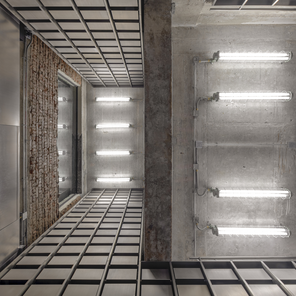
“Walking up towards the second floor, space is left untouched, as found. It is rough and even raw to the senses, immersing you in the tactile experience of traditional shopping. Here, stainless steel mirrored cabinets are suspended from the ceiling, [while] reflective surfaces hide their existence. With their rubber insides and the found space, they engage in a powerful dialogue creating an intimacy with the products, placing them straight into the hands of our shoppers.”
“Hong Kong is notoriously cramped, but despite its smallness, the two floors are spatially connected through the omnipresent rough brick walls, concrete ceilings, and continuous floor, creating an unanticipated and spacious illusion. The stainless steel powder room echoes this. With its glass wall, guests might second guess its function, but then a well-placed curtain creates playful privacy, leaving just feet exposed.”
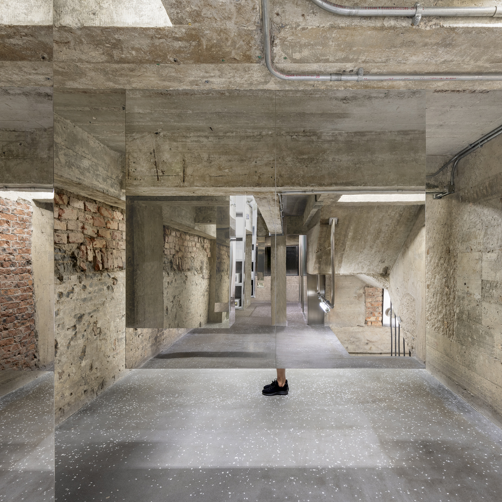

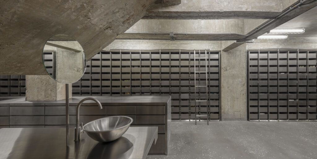
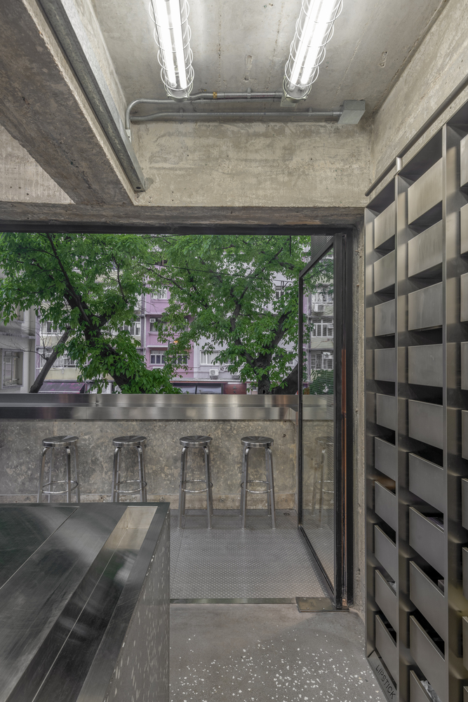
Ultimately, the space feels like a secret subterranean laboratory thanks to the textural stone and exposed brick, labyrinthine layout, and of course, all those mirrors. The illusion only breaks when you emerge into a room on the upper floor with a wide window overlooking the street, finding yourself at the same level as the branches of trees outside.
