Simple, Literal & Logo-Free Debranding


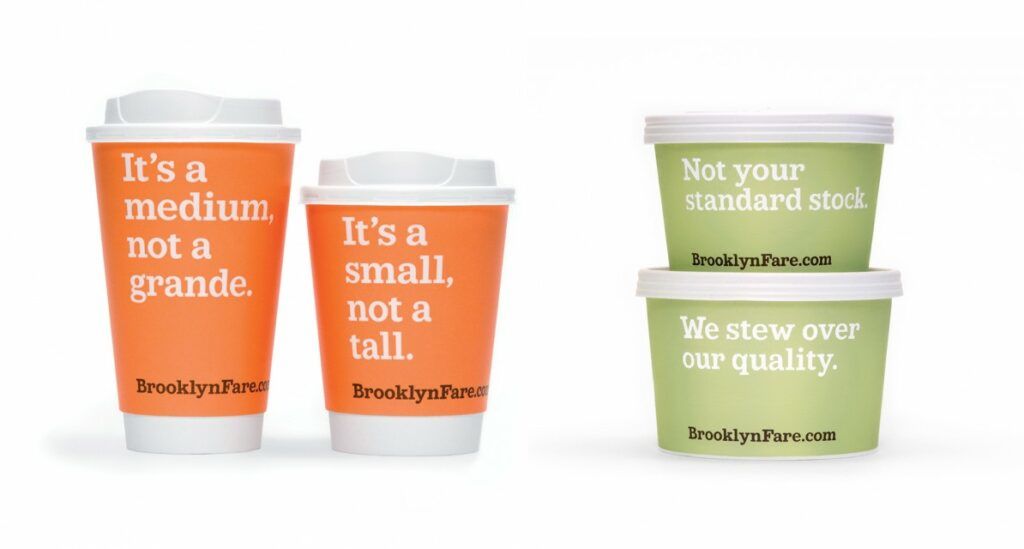

Skip the stylish brands on the shelves and overlook the stylized logos — this brand is speaking right to you in direct (and rather humorous) statements printed in simple font against bare one-color backgrounds. It’s a creative solution that proves graphic design doesn’t have to be flashy to be effective.
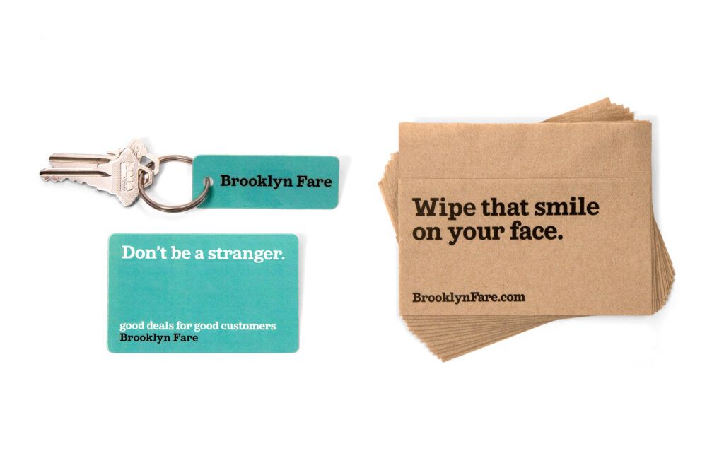

This is not exactly debranding in a pure sense, but close to it. The ‘logo’ – if it can be called that – is not in any special typeface and simply tells you the store name and web address. The ‘brand’ is built on sayings that are generic and overused to the point of being funny only when employed with this simple implied sarcasm.
Mucca Design (photos via EatMeDaily) wanted to do something different to make a local store stand out from its surroundings – and let you bring the sense of humor imbued in their packaging designs back home to stock in your own cupboards for future use.
By appealing to the trendy anti-brand movement these designers manage to blend kitsch, cliche and humor in a creative new way. This is a trend that might feel overplayed very soon, but for now, it’s fun and fresh, and might just get thousands of Brooklynites and tourists to stop at this little market instead of the mega store down the street.
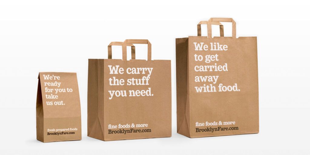

“Mucca was asked to develop a brand strategy for a new gourmet market opening in Brooklyn. Our competitive analysis and neighborhood survey revealed that Brooklynites preferred the personal attention and service of local stores. So our branding strategy positioned this new grocery store as the go-to resource for the locals – one that was just as approachable as the bodega down the street.”
“Following a detailed naming process, we established an engaging copywriting tone that become the star of the brand. Its sharp, irreverent New York voice asserts itself across all applications, from digital to environmental.”
