Colors Create Harmonious Ambience in Montreal’s Pastel Rita Café


Many decades and millions of dollars have been dedicated to crafting spaces in colors that emit specific emotions in humans and animals. The psychological effect of assorted hues is a consideration in hospital rooms, classrooms, museums, and prisons, among other locations.
When Gabriel Malenfant and Véronique Orban de Xivry decided to transform a 1,500 square foot empty office space on the Mile End district of Montreal into a mixed-use café, they chose Appareil Architecture for the renovation. Together, the group chose to color block the space to create a flowing environment that nurtured creativity and camaraderie in a low-impact marketing setting. The couple chose the name Pastel Rita as a tribute to Malenfant’s grandmother, Rita.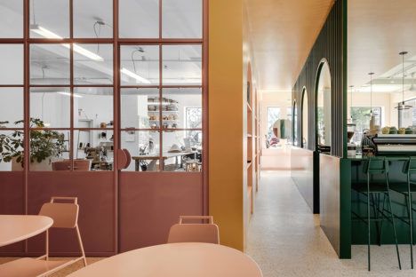
Color Palette
The three main colors in the interior of Pastel Rita are green, pink, and gold. Lightly colored linoleum flooring and natural light from large windows gently bind the areas together, resulting in a fluid environment that breeds artistic expression, insightful conversation, and a palpable positive vibe throughout the place.
The Ebb and Flow of the Color Scheme
The gold arches in the café frame pink alcoves on one side of the hallway. Artisan designed and produced items are displayed for sale here and created in the adjoining workshop. The café bar is deep green and matches the stools lined up at the bar.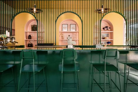
A gold passageway runs down the middle of Pastel Rita. A slatted screen separates the corridor from the forest green café space. Gold accents on the ceiling from the hallway create contrast.
Pale pink dominates the back of the space. Cozy nooks embrace welcoming booths that are paired with cocktail tables and chairs, all sharing the petal pink hue.
The workshop and bathroom colors are the only ones that deviate from the green/pink/gold theme. White walls and pastoral steel and wood trim set a tone of clear thinking for artists. The raging red bathroom has whimsical displays in cursive above each toilet in the phrase “artsy fartsy.”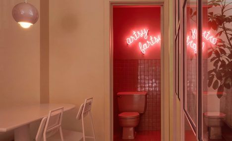
What the Colors Represent
Although the impact of colors on humans is debatable, studies have shown they do have measurable effects in many situations. The colors chosen for Pastel Rita make sense to create the atmosphere the owners and architects desired.
Green is positively associated with nature and rebirth. Green also represents tranquility, good luck, and health. Green wedding gowns in the 15th century represented fertility. Guests on TV talk shows wait to be called while sitting in green rooms that allegedly dissipate stress.
Ah, the power of yellow; it’s the color of sunshine and lemonade. Small doses of yellow, just like the gold highlights strewn throughout Pastel Rita, promote warmth and cheerfulness and are known to increase the body’s metabolism.
Pink is pretty innocuous. In small doses, it has a calming effect. Sports teams sometimes douse the opposition’s locker rooms in pink to reduce energy and increase passivity, and drunk tanks in jails frequently have pink walls to curb rowdiness.
Pastel Rita seems to have the ideal balance of color to inspire, create an aura of serenity, and treasure the company of friends. In the words of the inimitable Oscar Wilde, “Mere color, unspoiled by meaning, and unallied with definite form, can speak to the soul in a thousand different ways.”
