Ben Johnston’s Typographic Illusion Art Seems to Pop Off the Walls
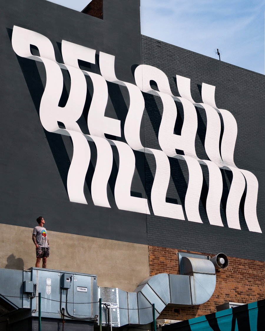
Large-scale text seems to pop and peel right off the walls in a series of fun outdoor optical illusion murals by creative director and muralist Ben Johnston. Phrases like “protect what you love,” “hold fast,” “good vibes,” and “Upper West Side” look like they’re rippling, leaning, or falling from the surfaces on which they’re painted, like brick walls and blank facades. Sometimes, the forced perspective makes you stop and wonder whether those surfaces are really flat after all.
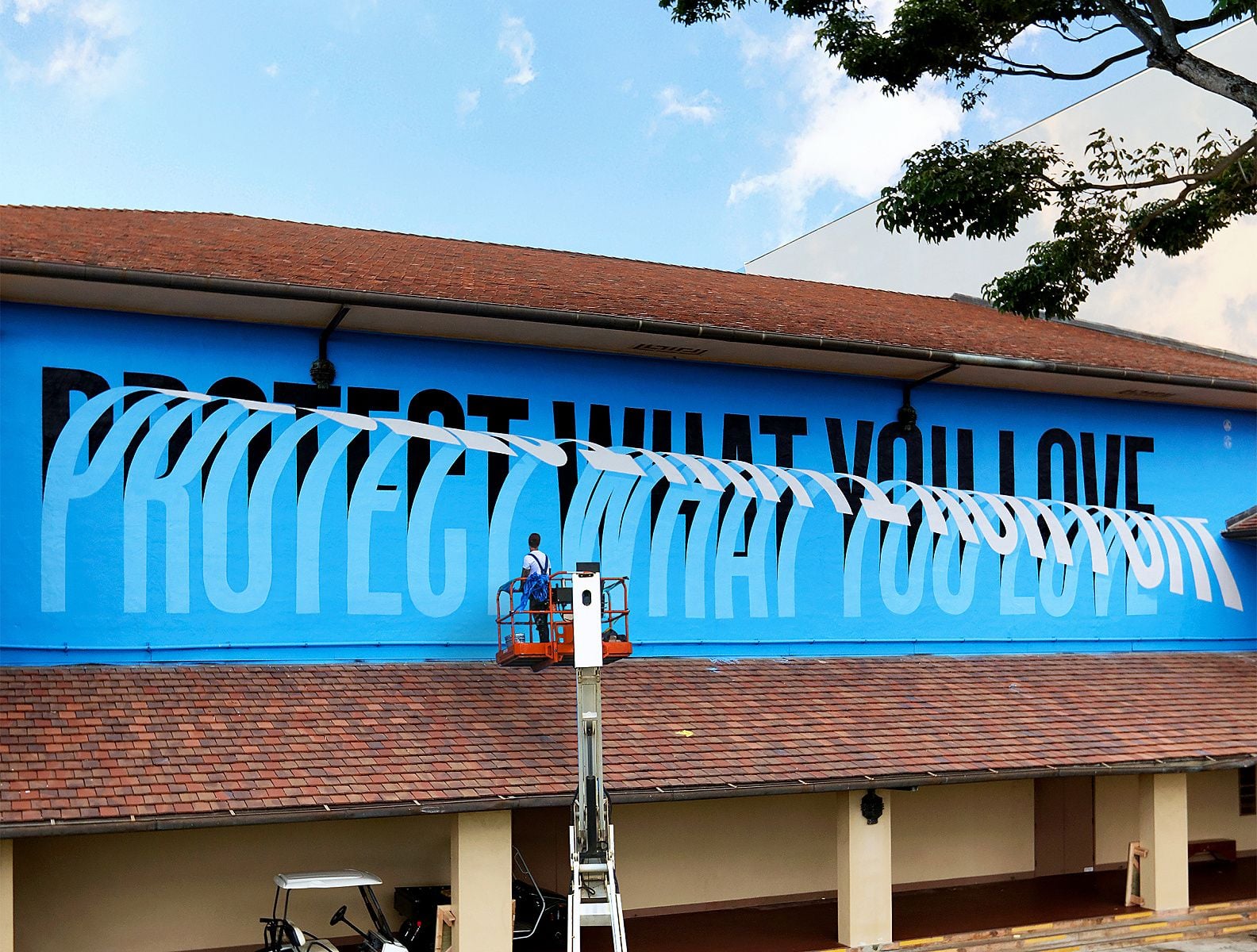
Do you ever wonder how illusions like this work? Our brains perceive elements of what we view as either figures (the objects of focus) or ground (the rest of the space). Think of the classic example of the image that can either be two faces looking at each other or a vase (the negative space in between them). Visual cues like perspective, highlights, and shadows help our brains decide which is which, but sometimes we get it wrong — like in the case of the infamous blue and black dress (or was it white and gold?).
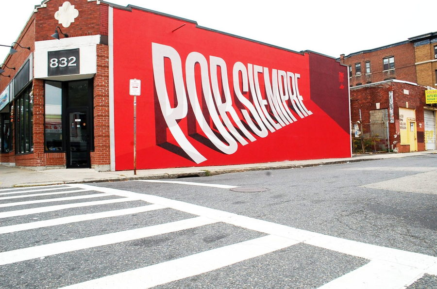
Designers and artists like Johnston can use those cues to make it look like flat, two-dimensional surfaces have 3D objects popping out of them. Sure, our rational brains know that these typographic murals aren’t really tumbling down the wall, but Ben’s mastery of the form results in near-perfect illusions that never fail to intrigue.
The “Heart of Gold” mural, for instance, has a delightful springiness to it that conveys excitement and enthusiasm. Johnston says it was created for a non-profit organization in Ontario around the idea that art can “inspire, transform, and help build a better community.” The town where the mural is located was once known for its nickel mining, so in homage, he came up with the slogan “City of Nickel, Heart of Gold.”
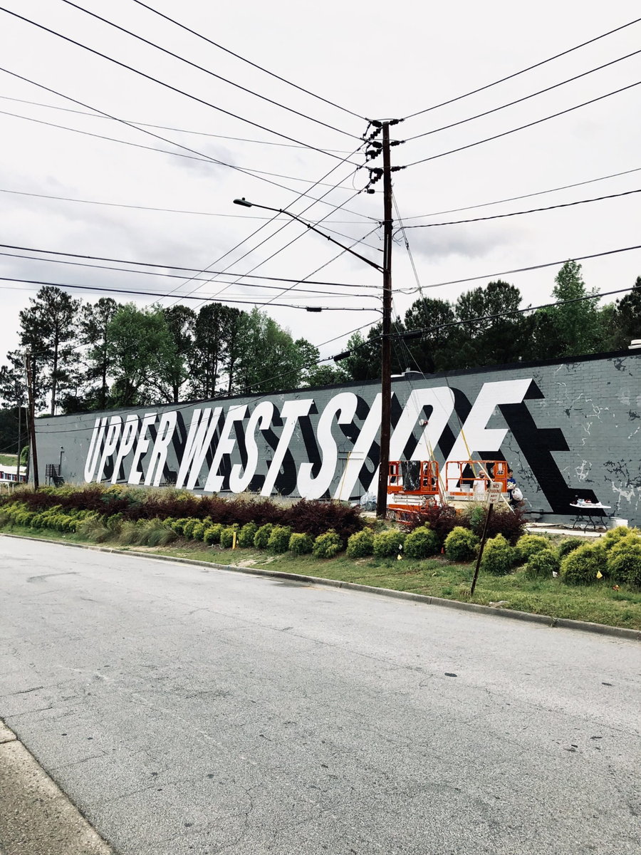
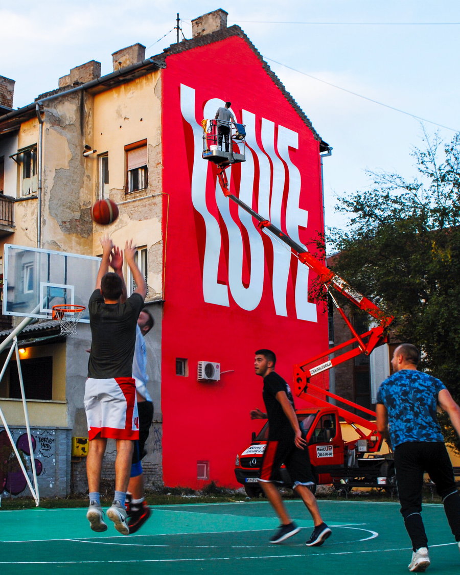
“I’ve always done art and painting throughout my school career when I was younger,” Johnston tells Typeroom. “After school I went traveling for a few years before deciding to study Product Design in Cape Town, South Africa. All the while studying I started playing around with graphic design and illustration. I dropped out of my course after a year and a half and decided to pursue graphic design. From there I got a job in a small agency and taught myself what I needed to know. After a few years of freelancing and working in ad agencies, I started working with lettering and type.”
The artist got his start with large-scale murals when a friend asked him to accent the entranceway of a new building. That was all it took for him to fall in love with the medium, and he’s been painting urban surfaces ever since, dividing his time between outdoor work and studio work for clients. On top of that, he also creates custom works for advertising, installations, and events, as well as his own fine art pieces shared in exhibitions.
“Raised in South Africa and currently splitting his time between Canada and the US, Ben has also been involved in various conferences and mural festivals around the world. As a multi-disciplinary artist and designer winning numerous awards for projects with Fortune 500 companies to working with a variety of NGOs, his main focus is on finding unique approaches to each opportunity, drawing on inspirations from his encounters throughout his travels.”


