All Angles: Colorful Geometric Interiors in Japan


Despite the fact that straight lines and perfect 90-degree angles are not commonly found in nature, we humans almost always build our artificial structures with rectilinear forms. We may have spent millennia huddling in caves, constructing simple huts or finding shelter in other irregularly-shaped domiciles, but with the rise of advanced civilization came an adherence to a simple formula: four vertical walls, a floor, and a roof. Of course, it’s easy to see why this is the case: it makes construction easy and cheap. But in the year 2017, why doesn’t modern architecture think outside the box and take on more complex geometries?
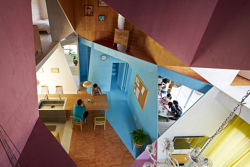
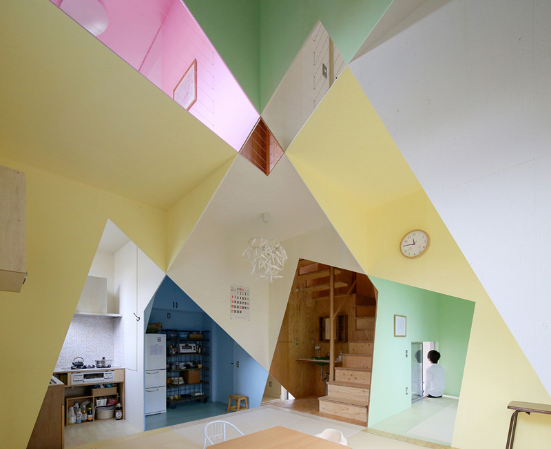
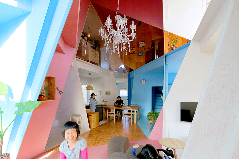
Kochi Architect’s Studio, a firm based in Japan, takes the ordinary grid-based home layout and subverts it by applying additional geometric shapes to the interiors in unexpected ways. Instead of surfaces that are all parallel and perpendicular to each other, this firm’s structures feature angled walls that bisect each other in surprising ways, and this effect is dramatically enhanced by the application of contrasting paint colors to them. The most recent example is “Ana House,” which was completed in 2016.

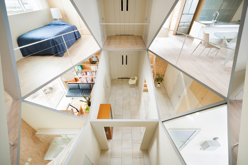
Located in Japan, Ana House was designed for a young family of four. The architects began with an unusually small plot of land, explaining that Japanese increases in both population and land prices after World War II resulted in high-density urban areas where even tiny building sites come at a premium. They knew they would have to divide the house into even smaller individual rooms, potentially resulting in a home that felt closed up and overcrowded.
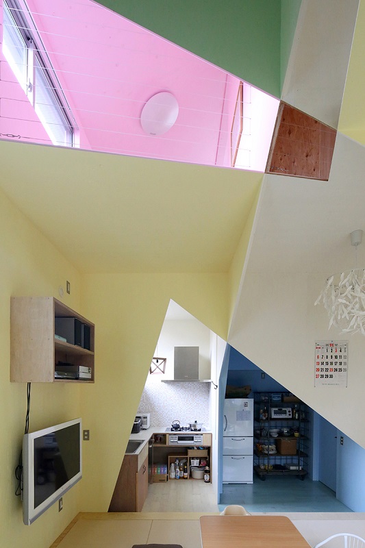
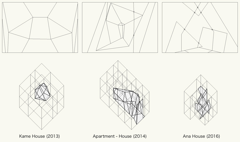
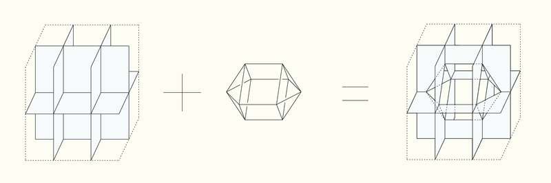
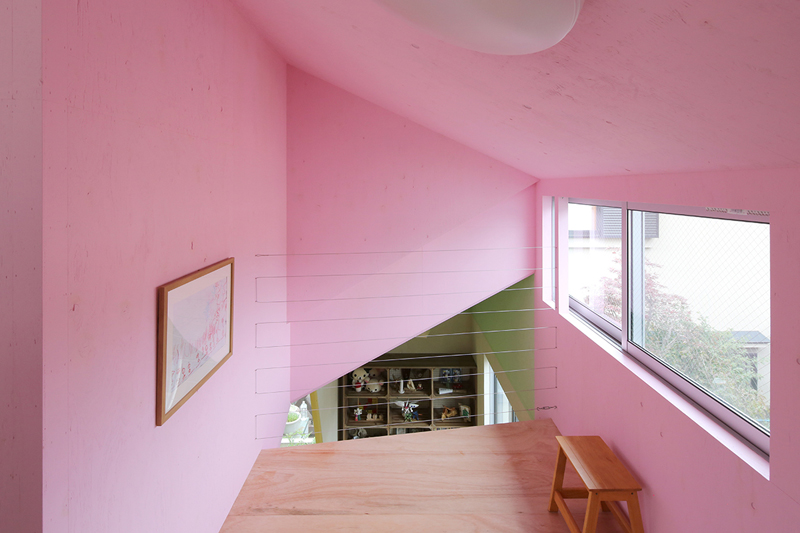
To solve this problem, Kochi started by envisioning a typical grid-based layout and then “drilling” into it, intersecting it with geometric shapes that cut out sections of each room in a central area to create a faceted common space full of diagonal lines. This scheme echoes the approach taken in Kochi Architect’s previous projects, “Apartment House” (2014) and “Kame House” (2013.)
“In the case of Apartment House (2014), I painted four colors to emphasize difference between each group of rooms,” explains Kochi. “Ana House has seven colors to emphasize difference between each room. To give space density, this is the operation to increase the number of space which is a molecule. The shape of the hole appears as the set of the opening in a wall and floor. The holes in Kame House and Apartment House were polyhedron as a volume, but the hole in Ana House changes to an overlapping of the plane opening such as a square or triangle on the wall or the floor, making it difficult to recognize it as a volume.”
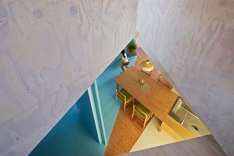
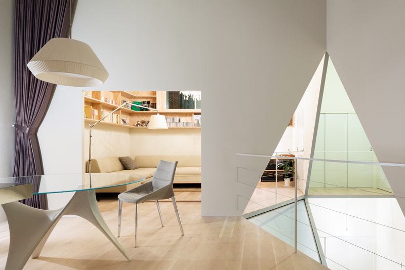
You can really see what the architect means when you look at photos of the interior of the Ana House. It’s hard to tell how all of these planes intersect without actually being in the three-dimensional space, where you could walk around and view it from multiple angles. The result is pleasantly disorienting, succeeding in making the home seem much larger than it really is and far more interesting than it would be with a more conventional layout.
“I started designing with a desire to discover overcrowding spatiality,” says Kochi. “In order to create ‘high-density scenery’ where you can see plenty of places, I set the formula ‘spatial density = number of rooms /volume.’ If you can see many rooms in a smaller space, the space density will rise.”