6 Dreamy Nature-Inspired Color Palettes for Your Living Room
“Beauty is in the eye of the beholder.” Margaret Wolfe Hungerford acknowledged this in her writing nearly 150 years ago, and recently HomeAdvisor brought the concept home with color palettes based on wildly different natural landscapes.
The idea was to bring nature inside, and to recognize that there are many colors in nature besides the obvious forest green and ocean blue. As a design element, it’s nothing new to look for inspiration in one’s surroundings, but this project has brought to life six sceneries you likely haven’t considered before. For a fun vision of what your living room could become with the creative use of color, HomeAdvisor digitally recreated six natural wonders and placed them into the same room for visual consideration.
Mount Fuji
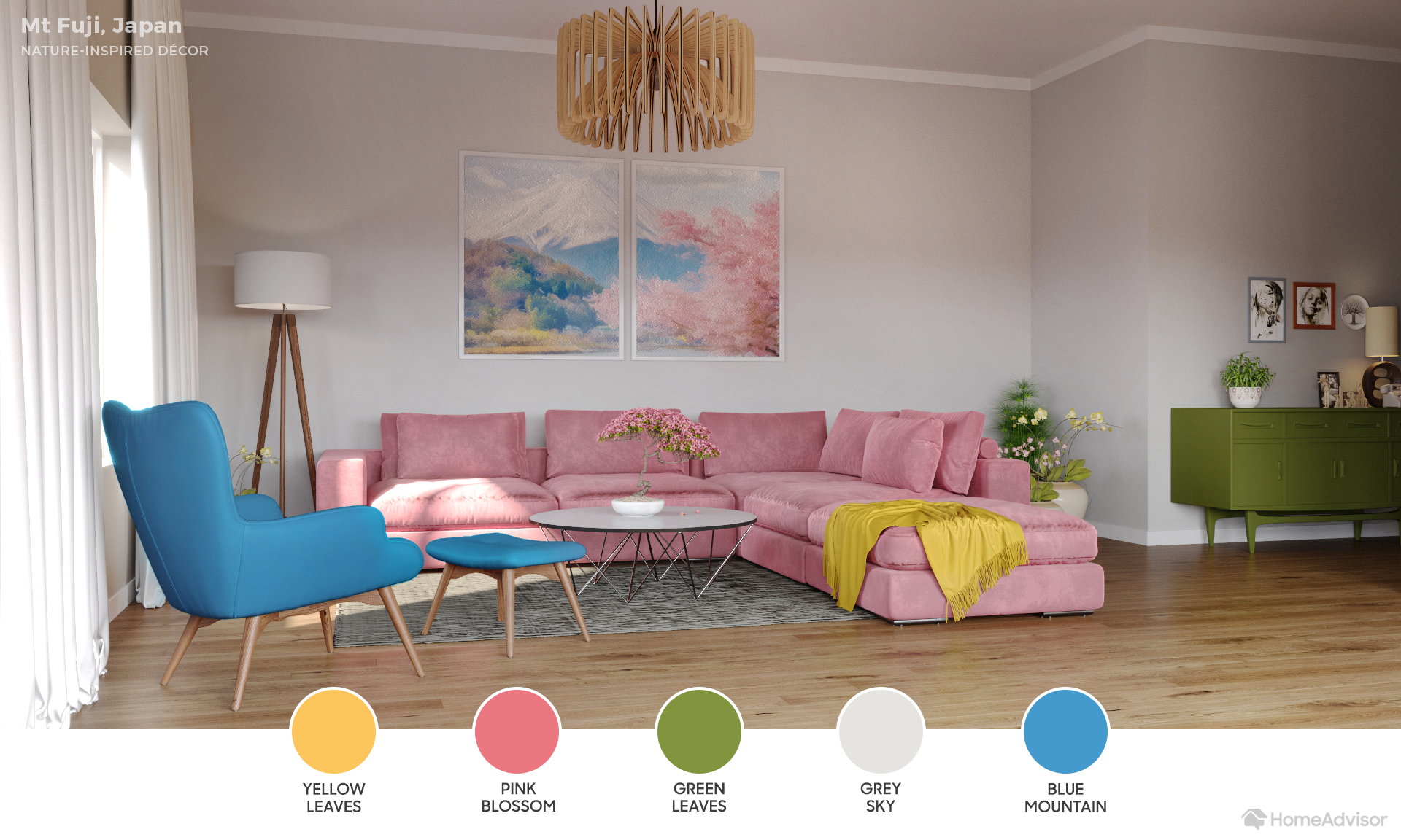
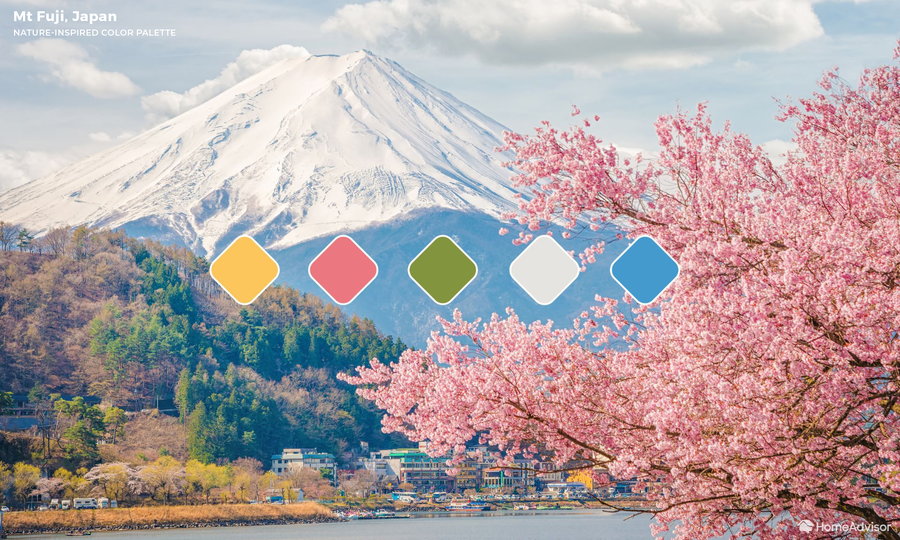
Japan’s highest mountain has been the subject of every art form for generations, but by scaling out from the mountain, the scenery encompasses a larger swath of the country, including vibrant tree blossoms. For this play on nature, designers placed a strikingly pink couch as the focal point and toned down the space with snowy white walls as a backdrop. The yellow and green leaves alongside namesake mountain also influence the space.
Grand Canyon
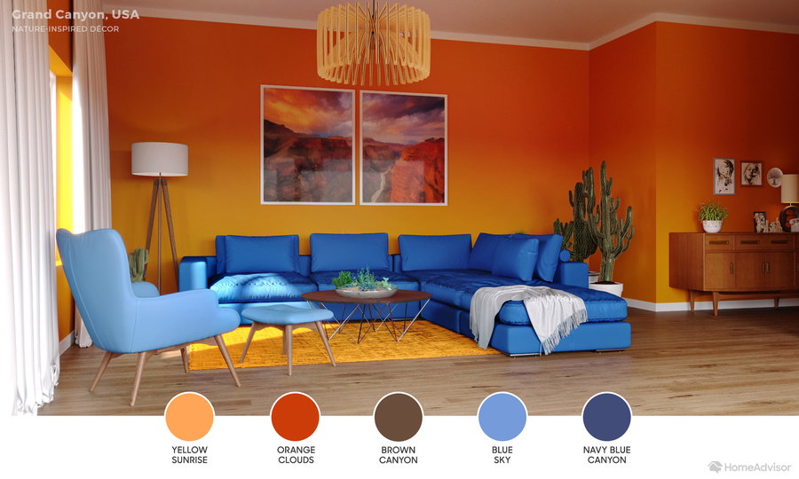
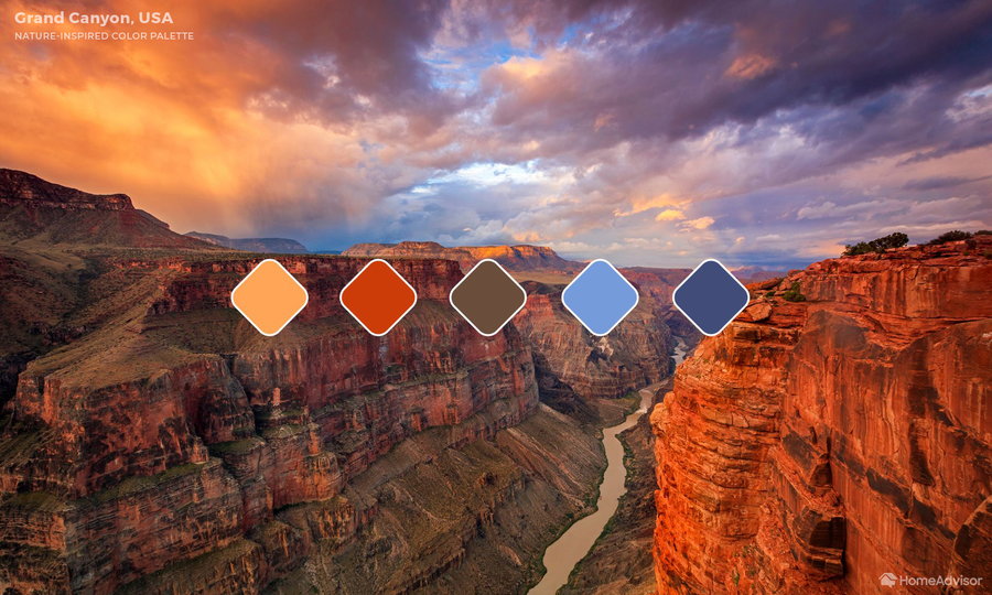
While the Grand Canyon might look burnt orange or clay in color, the play of light and consideration of the blue water and sky backdrops here brings together a palette of yellow sunrise, orange cloud, blue sky, and brown canyon.
Serengeti
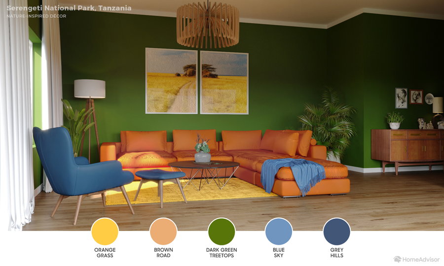
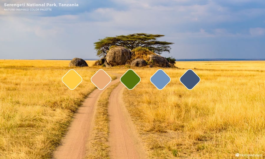
While the Serengeti is another landscape that may conjure images of a singular sheet of yellow sand, a closer look at the horizon overhead brings out a range of blues and greens. The sample image is replicated through colors of orange grass, brown road, dark green treetops, blue sky, and gray hills. HomeAdvisor experts decided to highlight the dark green while using yellow and orange as accent colors. With this palette in hand, you can turn your living ares into your own version of the desert.
Great Barrier Reef
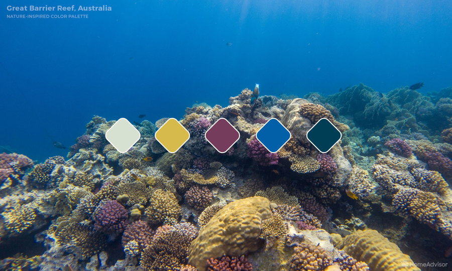
A view that less people have an opportunity to take in first-hand is the dynamic and colorful underwater world of the Great Barrier Reef. Coral, plants, fish, and the filtered light from the surface contribute a multitude of shades to play with in an interior space. This design relies on the deep blue shadow and lighter blue water to set the stage as wall color, while the decor represents purple and yellow coral intermixed with white sunlight.
Yellowstone Caldera
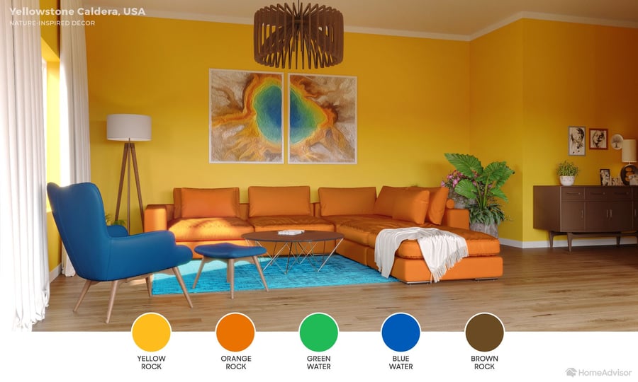
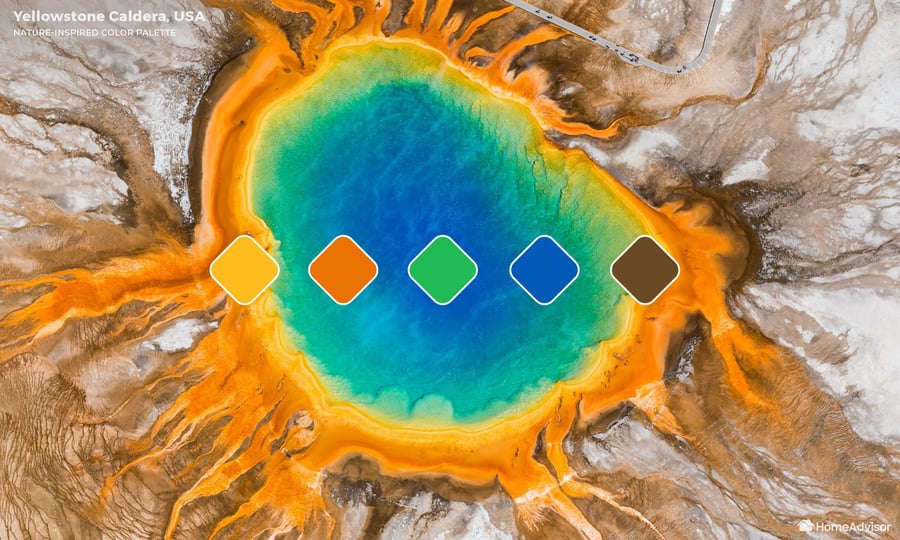
This palette relies on a dramatic aerial view of the famed caldera, which capitalizes on the color range from deep water blue out to the surrounding orange rock. In between is green water, as well as a few splashes of yellow and brown. The former is chosen as the wall color, warmed by blue and orange furniture and natural greenery.
Banff National Park

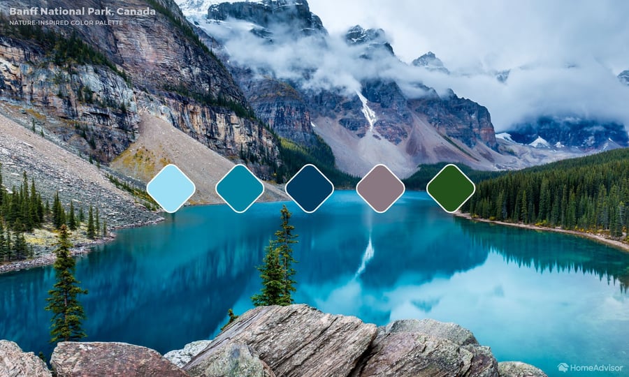
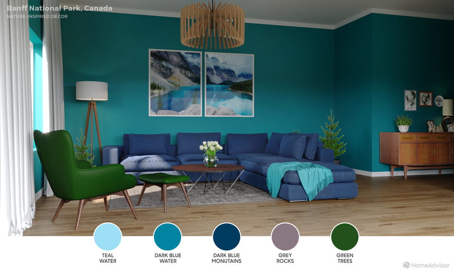
Banff is a prime example of rugged wilderness. Vast forests, copious water, and towering mountains set the scene for a nature-inspired living room that melds colors close together on the color wheel rather than those with stark contrast. Teal, along with shades of blue, deep green, and gray, make up this palette, which of course can always be adjusted to match your interests if you prefer.
For each palette, HomeAdvisor offers at least one specific paint match to get you started, but the real joy is in using the project as inspiration to bring your own definition of natural beauty into your living room.


