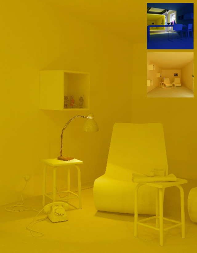
Powerful Monochromatic Interior Paint


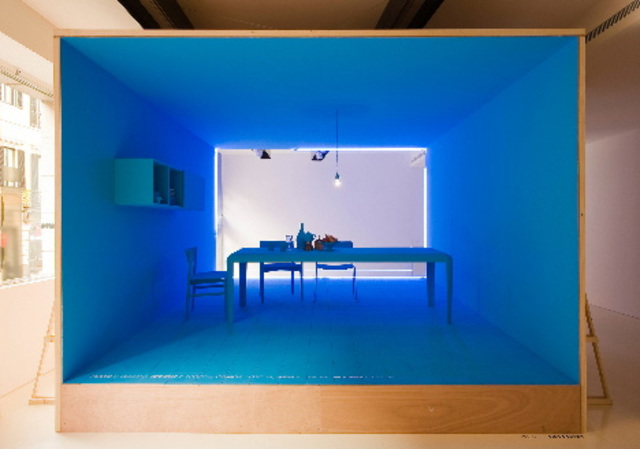
Can you imagine having to choose just one color with which to surround yourself, from floor to ceiling, wall to wall, and everything else in between? We are very familiar with organizing an image or space in front of us in part by colorful contrasts, which this installation strips away from the onlooker. No, this is not a proposal for a place to live – it is an artistic/designer experiment in using monochromatic color schemes (bright blue, dark purple, mid-tone yellow and more) to place the emphasis on the total area.
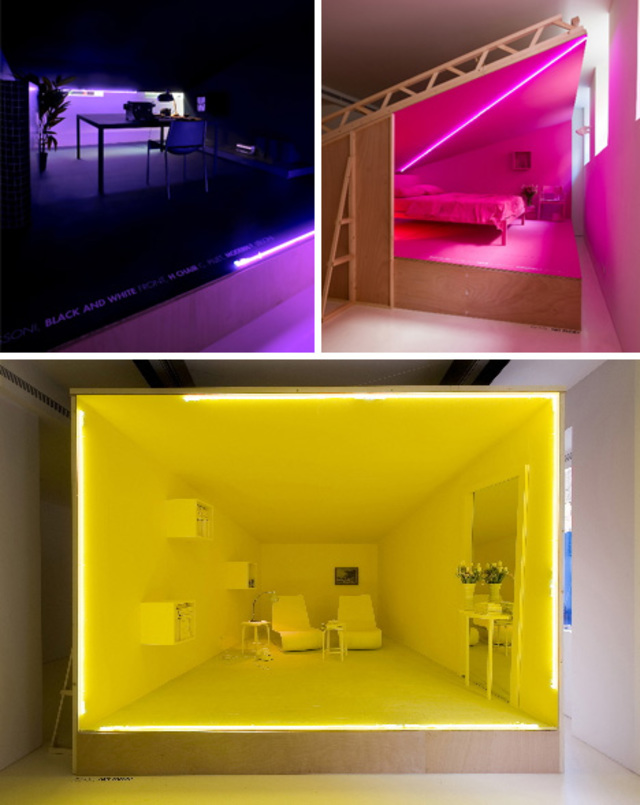
Whether you like the layouts or not, find the colors compelling or distracting, these designers have to be appreciated for taking an unusual approach to highlighting the essential figures and voids of an interior space. If you look at the pictures just right, you begin to see past the pieces of furniture and get a sense of the underlying functions and unique spatial relationships.
Presented with this exhibition at the Salone del Mobile in Milan by Porro, a viewer walks away with less memory of the singular furnishings, textures or materials and more of a sense of total-room recall. However, if the work inspired you to paint your bedroom, bathroom, living or dining room in a single color, well, so be it – just be sure to buy enough before you start!
“Creative vitality and capability to interact, curiosity in exploring apparently different worlds that however share the same passion for quality: that is why Porro is today a trendsetting brand, always at the forefront, willing to experiment and try itself out.”

“This important legacy has always been shared with many of the leading Italian and international designers, such as Piero Lissoni, the firm’s art director since 1989, Jean Marie Massaud, Christophe Pillet, Piergiorgio Cazzaniga, Bruno Munari, Decoma Design, Elisa Ossino, Werner Aisslinger, Wolfgang Tolk, Front, Alessandro Mendini, Soda Designers, GamFratesi. “
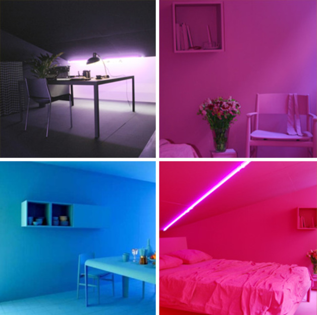
But wait .. why use different colors for different rooms? Again: one cannot view this project as a set of literal suggestions for what paint works best where, or which tones fit what types of spaces, but simply a way to offset one layout from the next (and perhaps burn each one into a different part of your retina to spare too might sight loss in the face of such bright interiors).